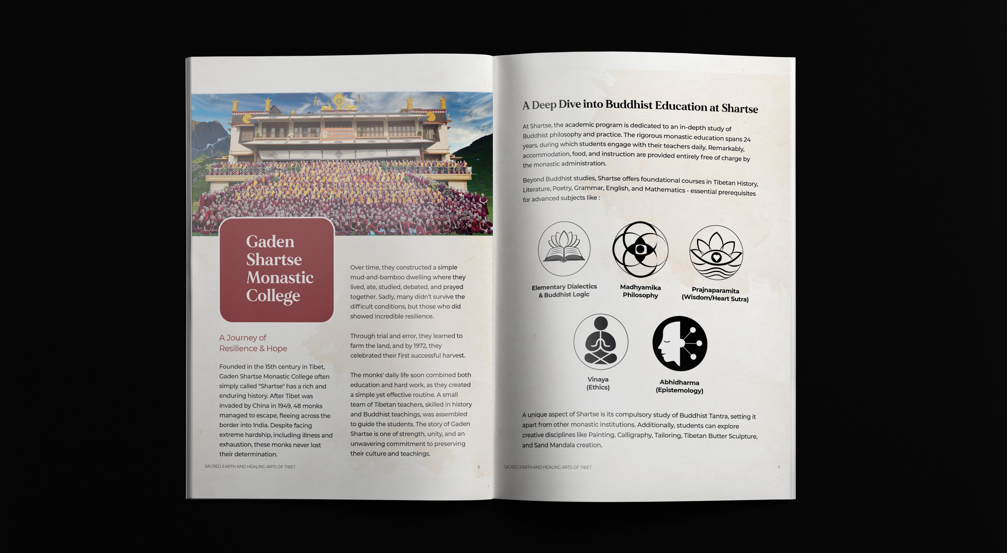
Gaden Shartse Monastery
Gaden Shartse Monastery
Gaden
Shartse
Monastery
Editorial media kit design
Brand identity and
design system
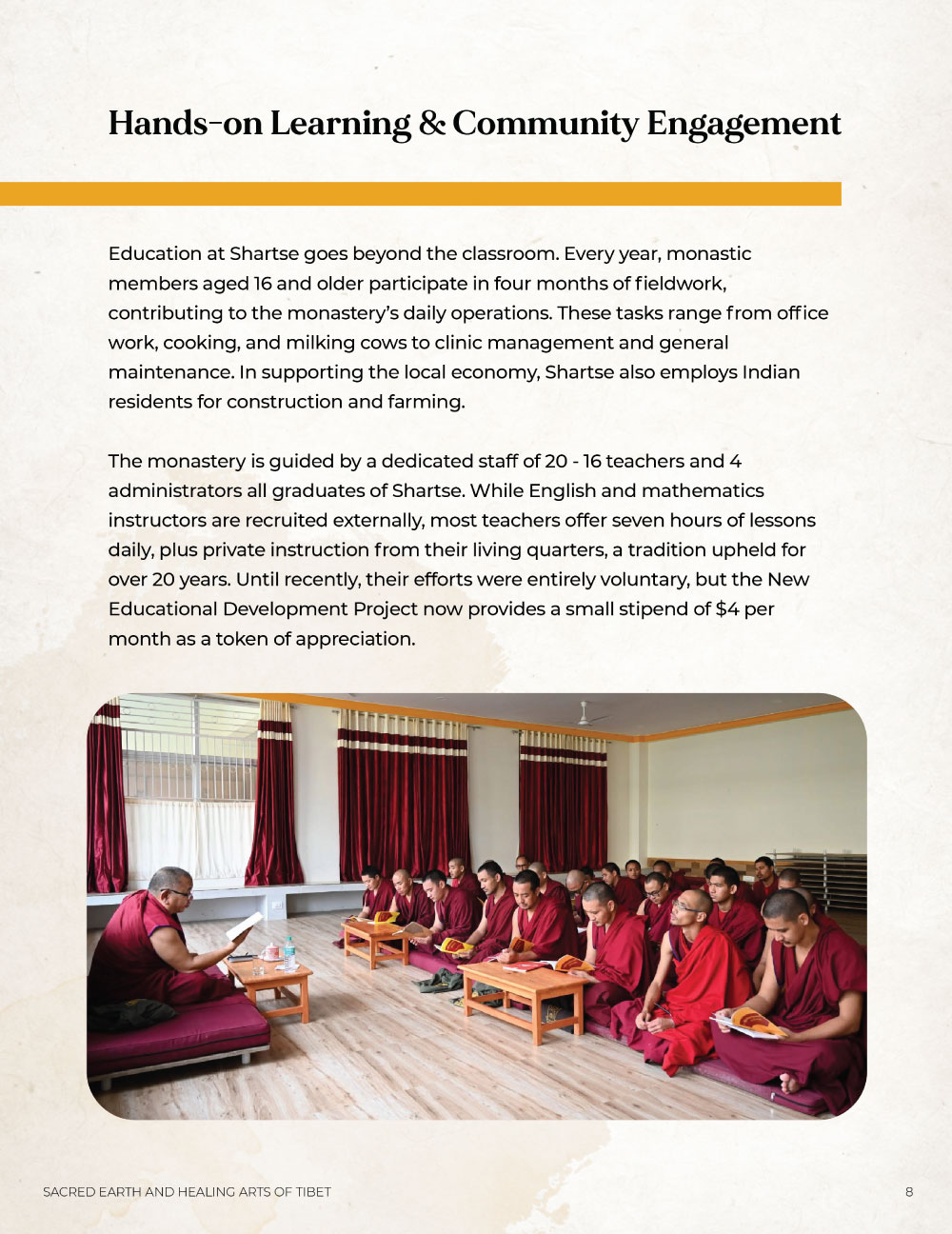
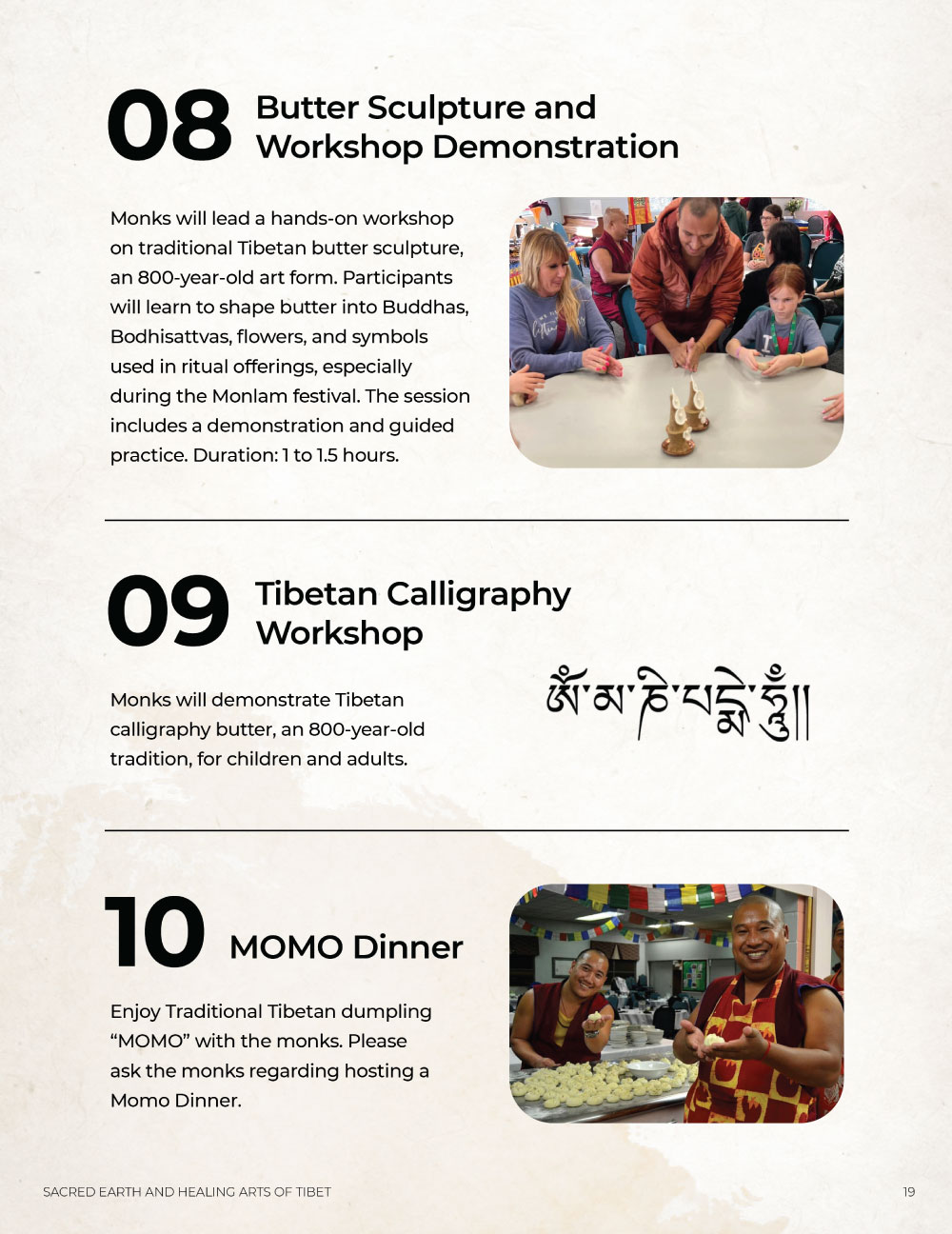
Gaden Shartse Monastery is a renowned Tibetan Buddhist monastery dedicated to preserving and teaching classical Buddhist philosophy, debate, and spiritual practice, while sustaining centuries-old monastic traditions. This project focuses on designing a comprehensive press kit for their USA tour to communicate their mission, promote teachings and workshops, and support fundraising efforts that help sustain the monastery and its educational initiatives.
Gaden Shartse Monastery is a renowned Tibetan Buddhist monastery dedicated to preserving and teaching classical Buddhist philosophy, debate, and spiritual practice, while sustaining centuries-old monastic traditions. This project focuses on designing a comprehensive press kit for their USA tour to communicate their mission, promote teachings and workshops, and support fundraising efforts that help sustain the monastery and its educational initiatives.
Role
Role
Lead designer
Lead designer
Client
Client
Gaden Shartse Monastery
Gaden Shartse Monastery
Year
Year
2022
2022
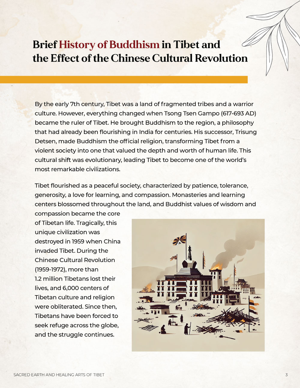
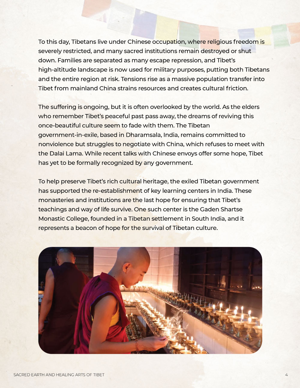
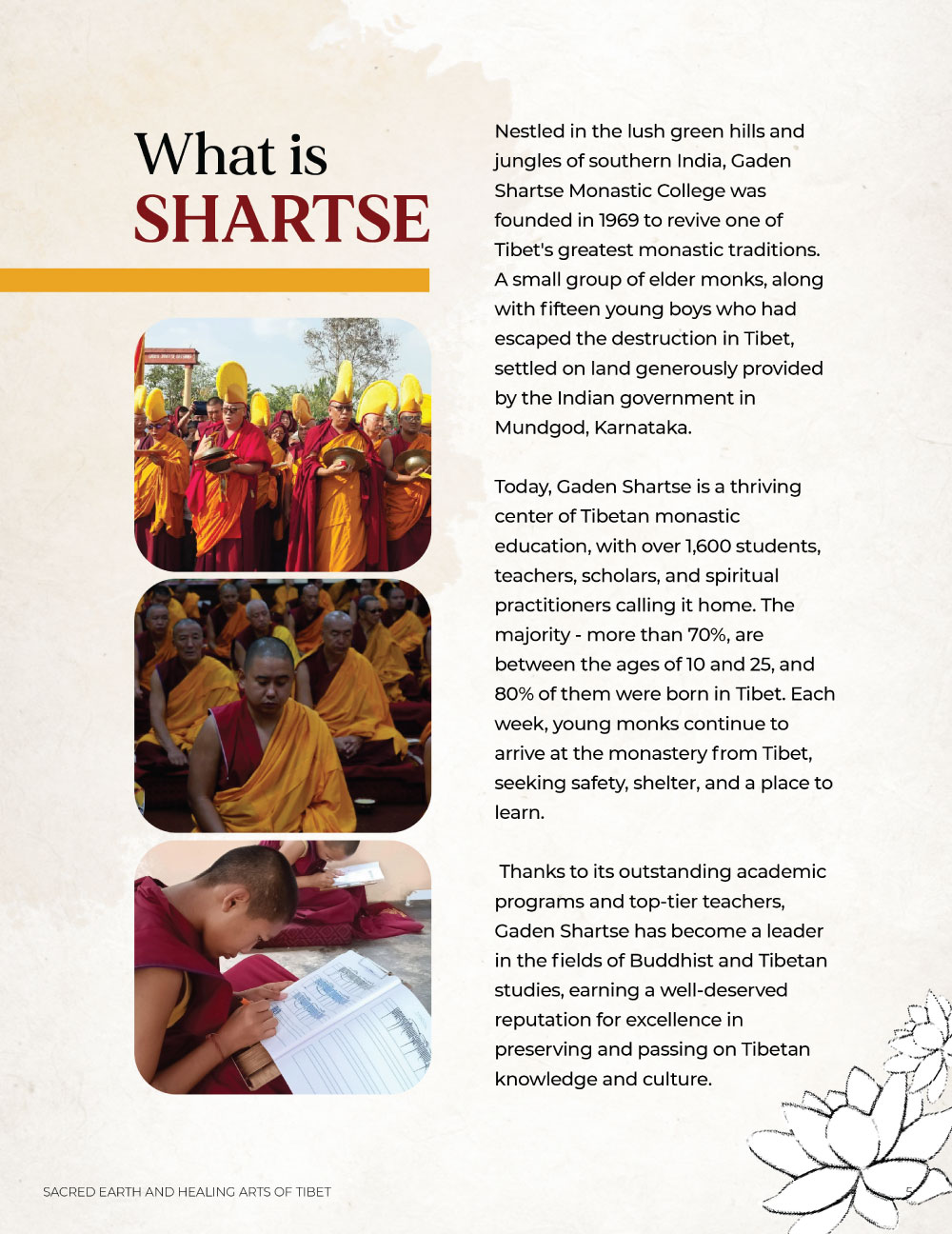
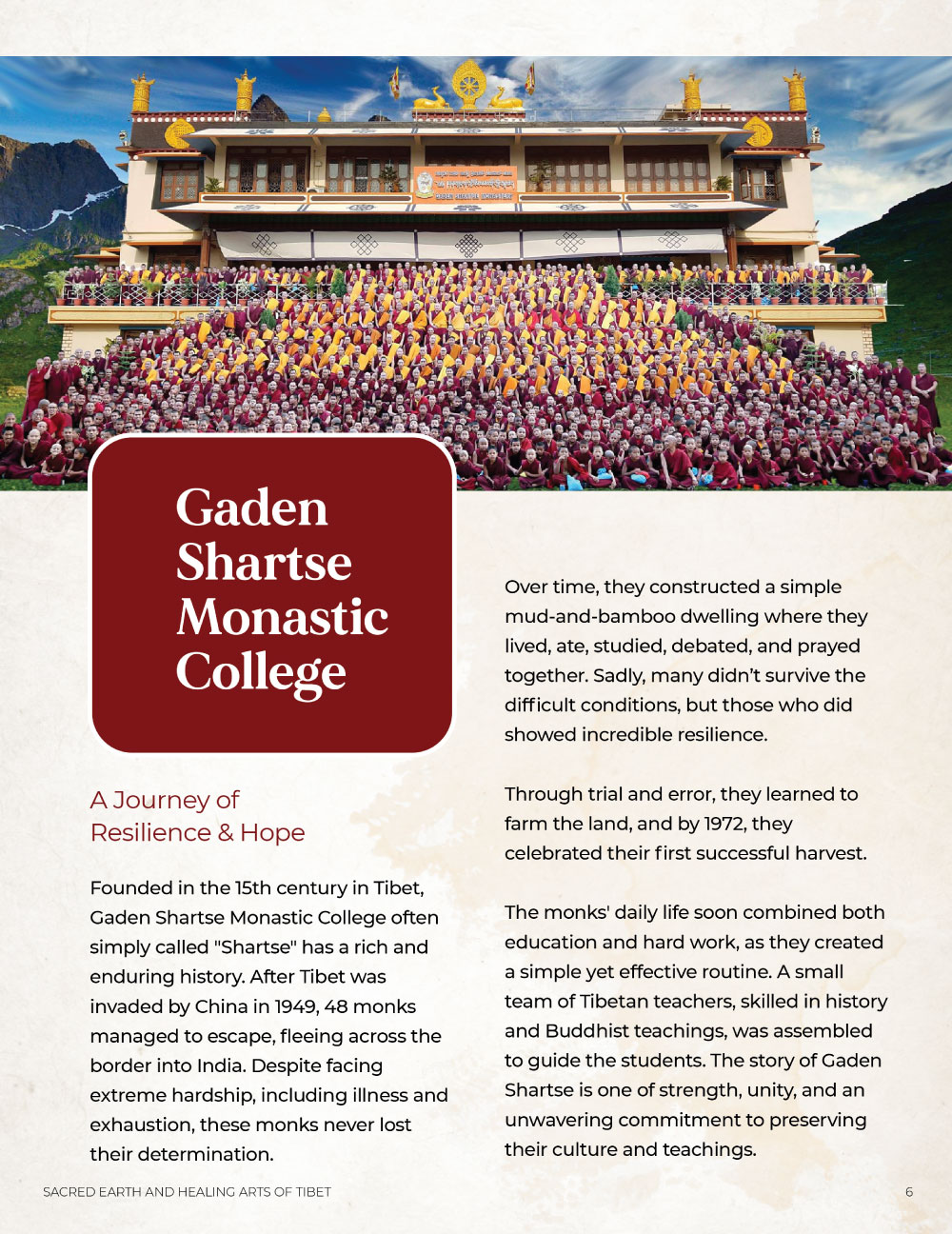
Understanding the Problem :
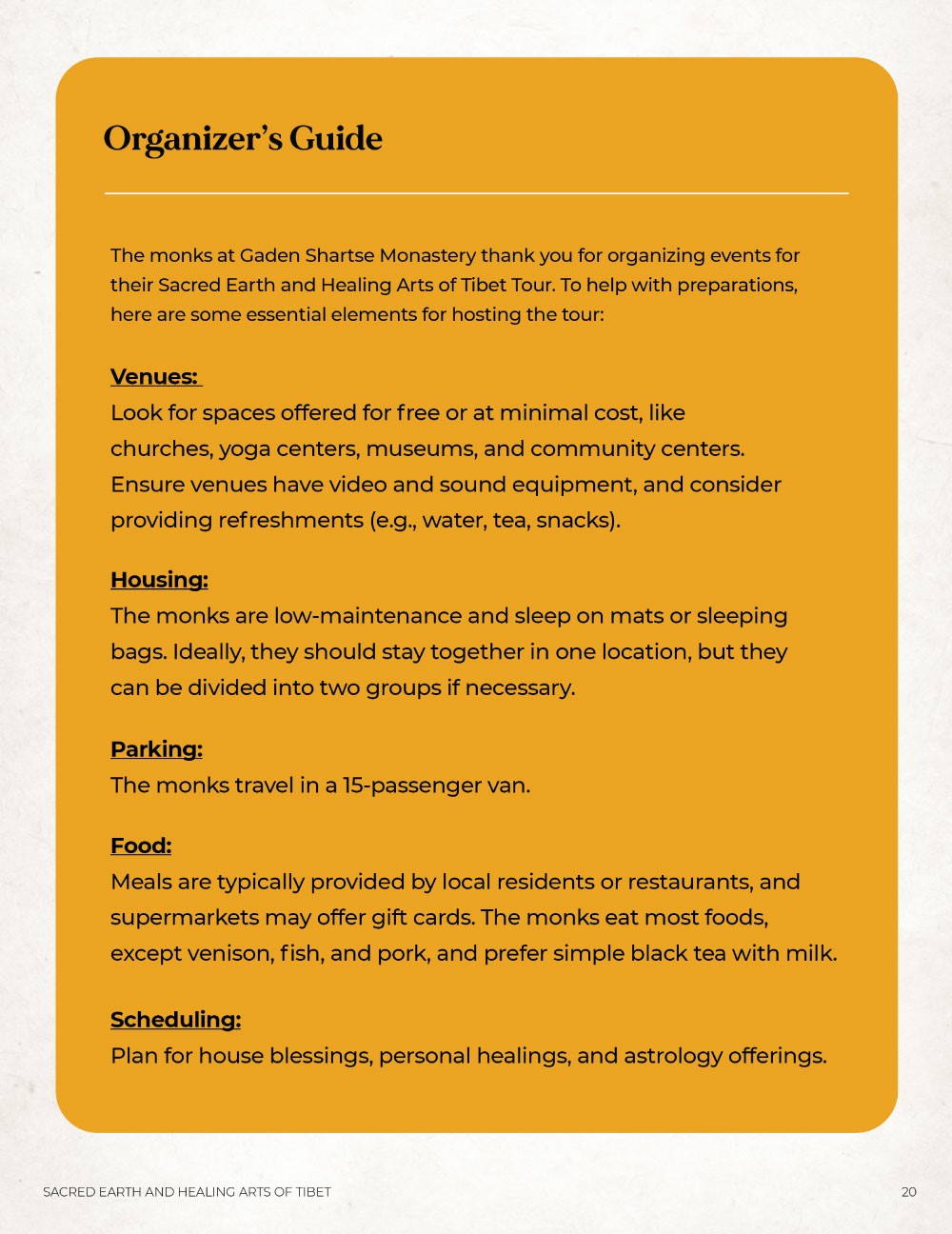
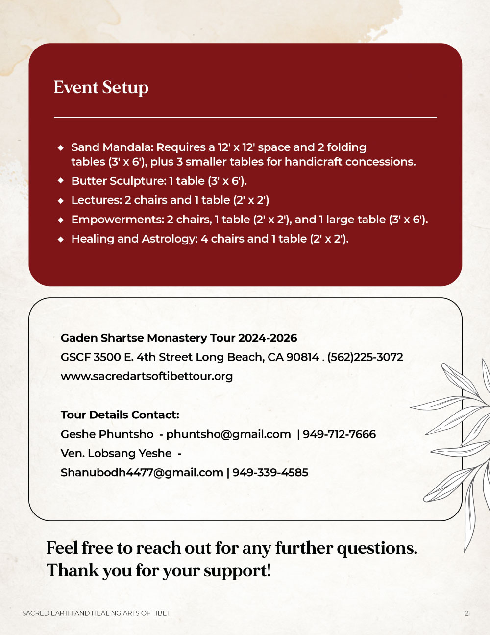
Despite their rich cultural offerings such as Sand Mandala workshops and sacred teachings, the monastery lacked high-quality, standardized promotional materials to engage Western media and host institutions. They needed a versatile tool to bridge the gap between their remote Indian location and global fundraising targets. The challenge was to organize dense historical and academic information into an accessible global quality document that could serve as both a brand introduction and a logistical hosting guide.
The Solution :
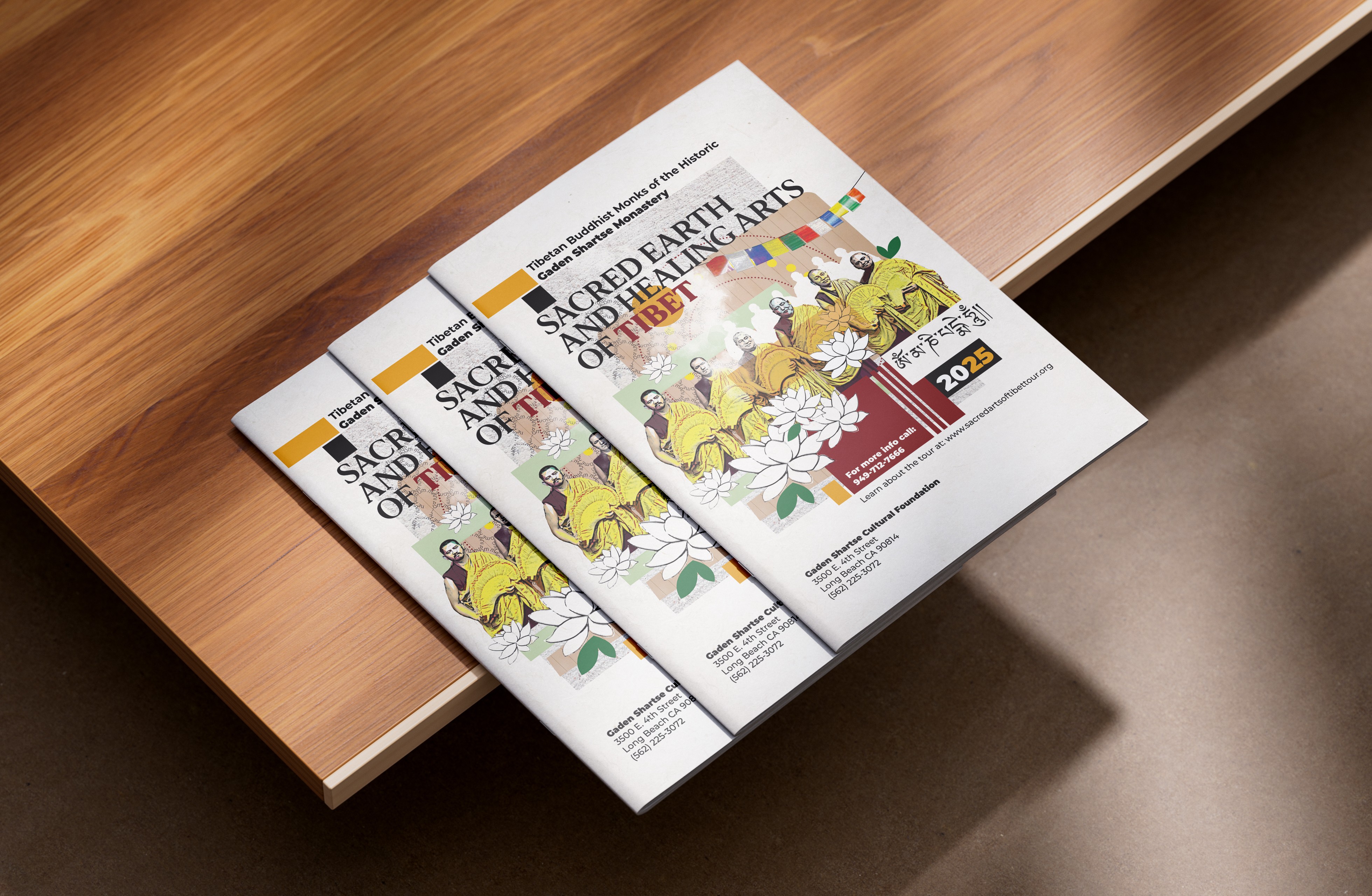
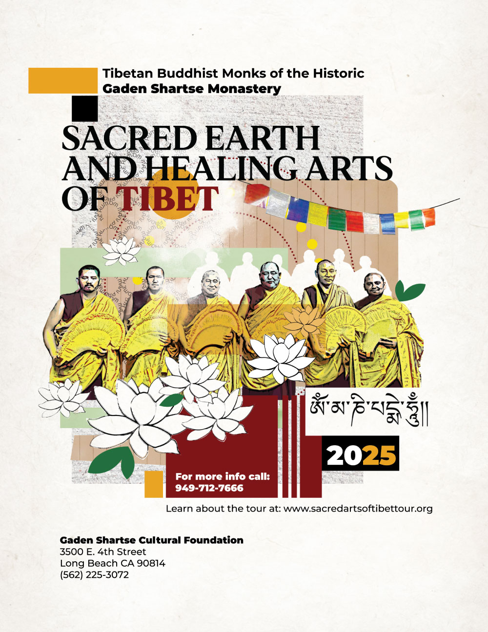
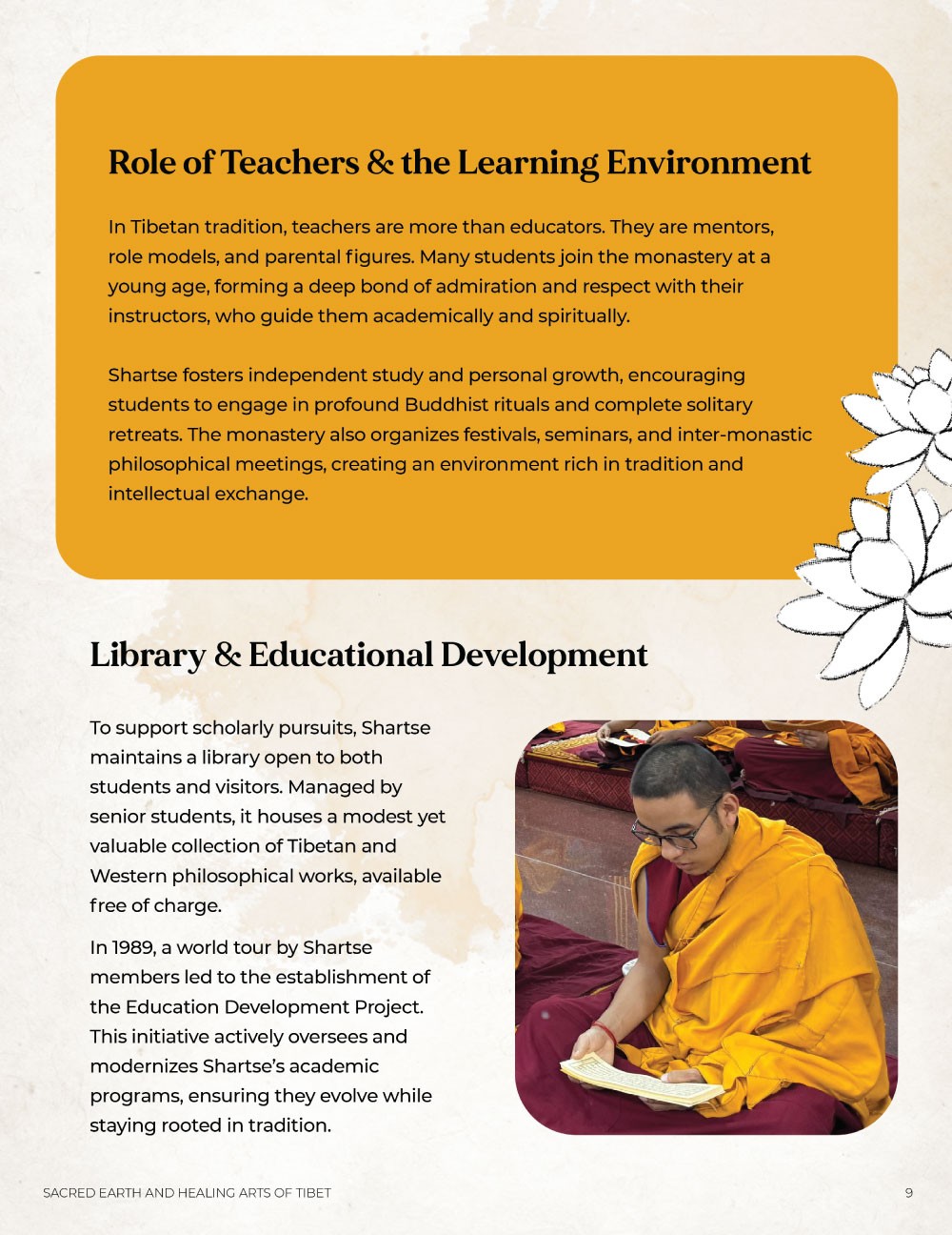
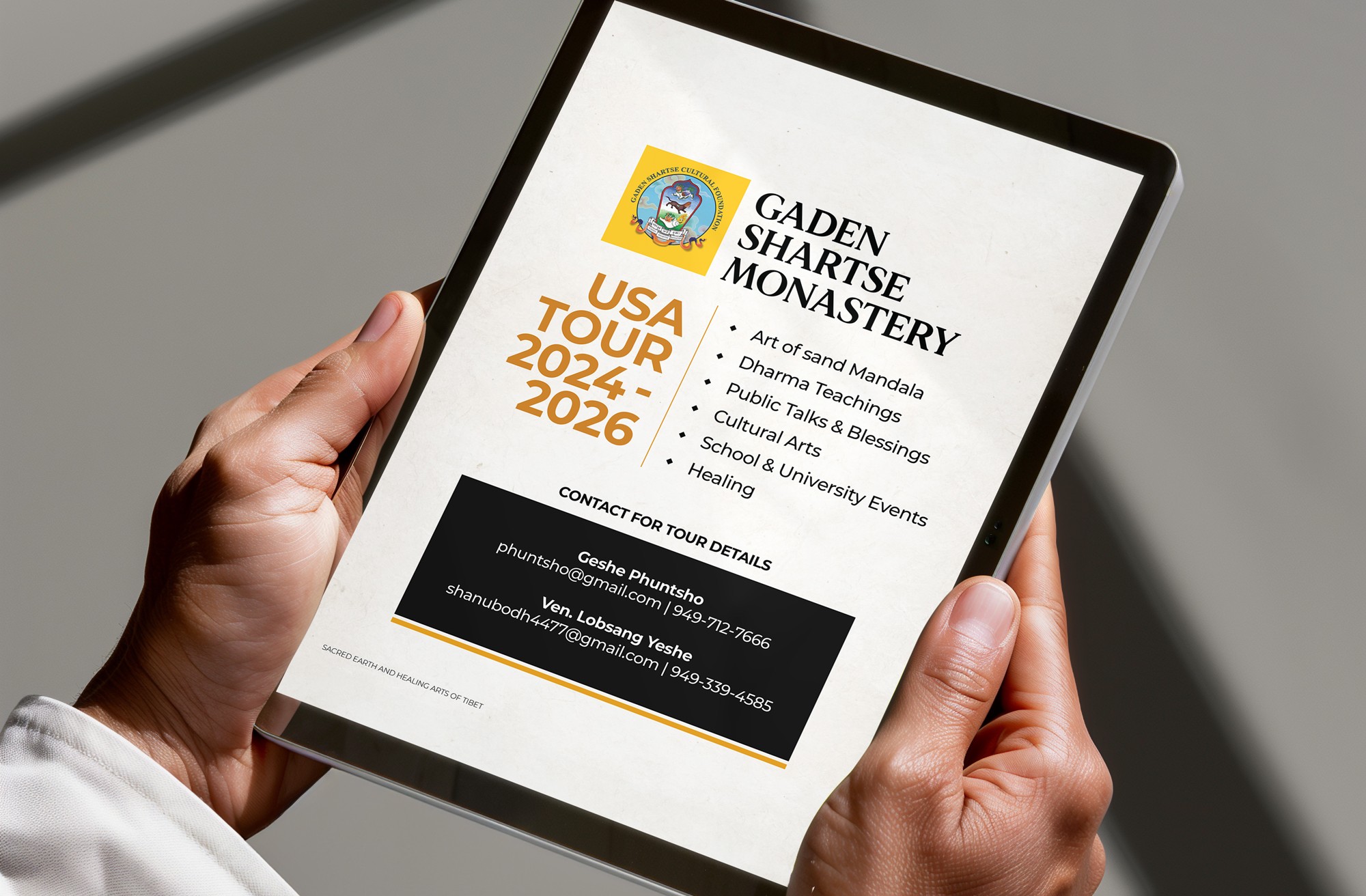
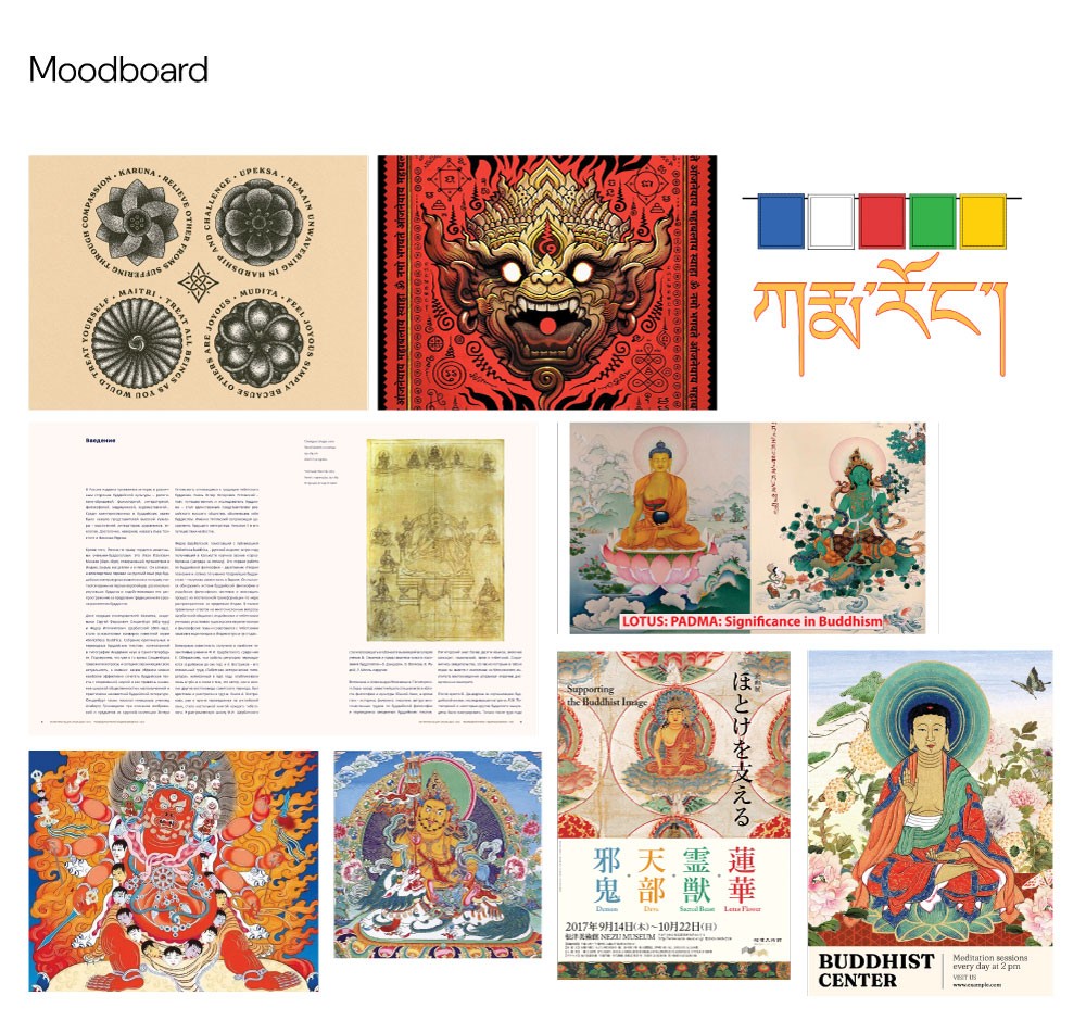
Working directly with a monastery co-ordinater, we developed a modern yet rooted visual identity that utilized sacred symbolism, such as the lotus for purity and a color palette derived from their prayer flags. I integrated textures inspired by sand mandalas and traditional mantras as subtle design elements, pairing them with approachable typography and authentic photographs. The final press kit provides an exhaustive look at their team, workshops, and ideologies, functioning as a definitive guide for sponsors while maintaining the humble, accessible spirit of the monastery.
Understanding the problem :
Despite their rich cultural offerings such as Sand Mandala workshops and sacred teachings, the monastery lacked high-quality, standardized promotional materials to engage Western media and host institutions. They needed a versatile tool to bridge the gap between their remote Indian location and global fundraising targets. The challenge was to organize dense historical and academic information into an accessible global quality document that could serve as both a brand introduction and a logistical hosting guide.
The Solution :
Working directly with a monastery co-ordinater, we developed a modern yet rooted visual identity that utilized sacred symbolism, such as the lotus for purity and a color palette derived from their prayer flags. I integrated textures inspired by sand mandalas and traditional mantras as subtle design elements, pairing them with approachable typography and authentic photographs. The final press kit provides an exhaustive look at their team, workshops, and ideologies, functioning as a definitive guide for sponsors while maintaining the humble, accessible spirit of the monastery.
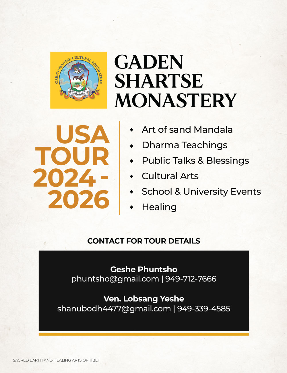
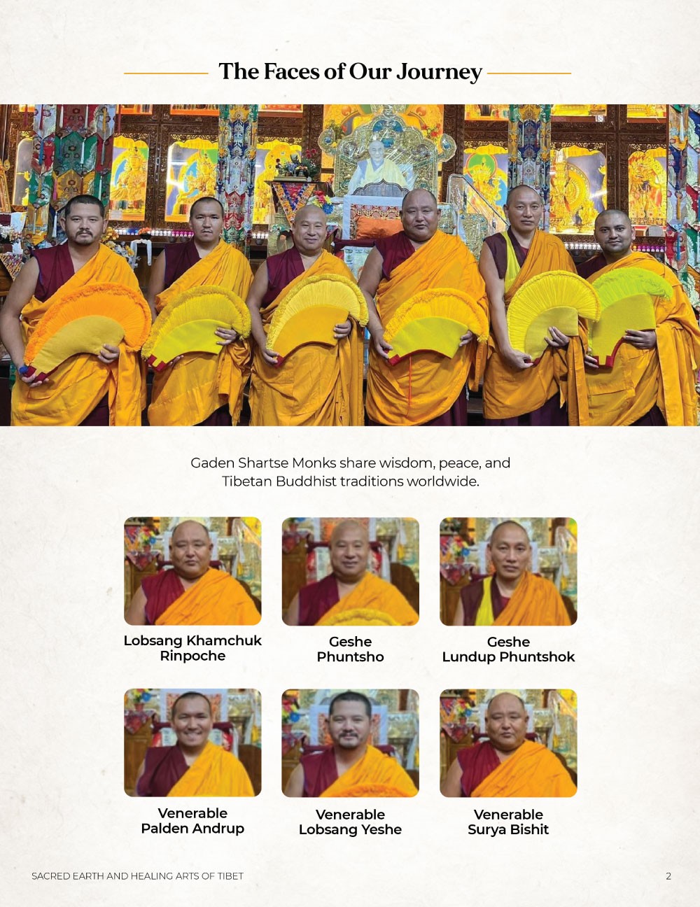
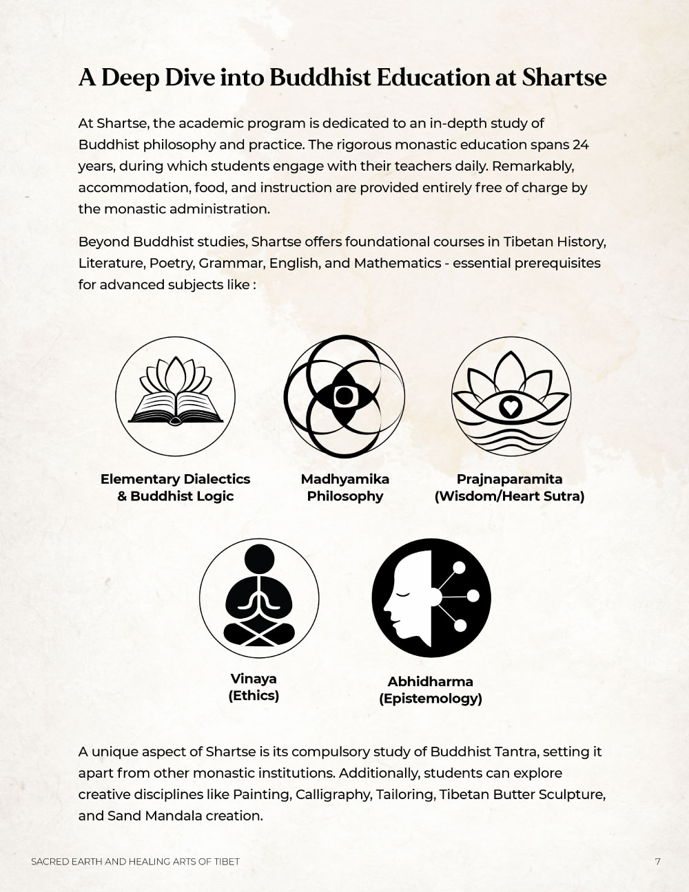

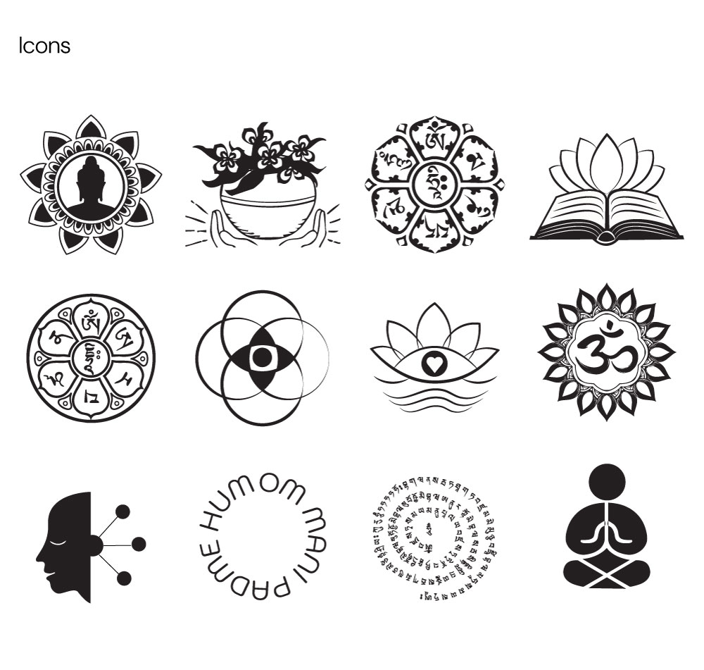
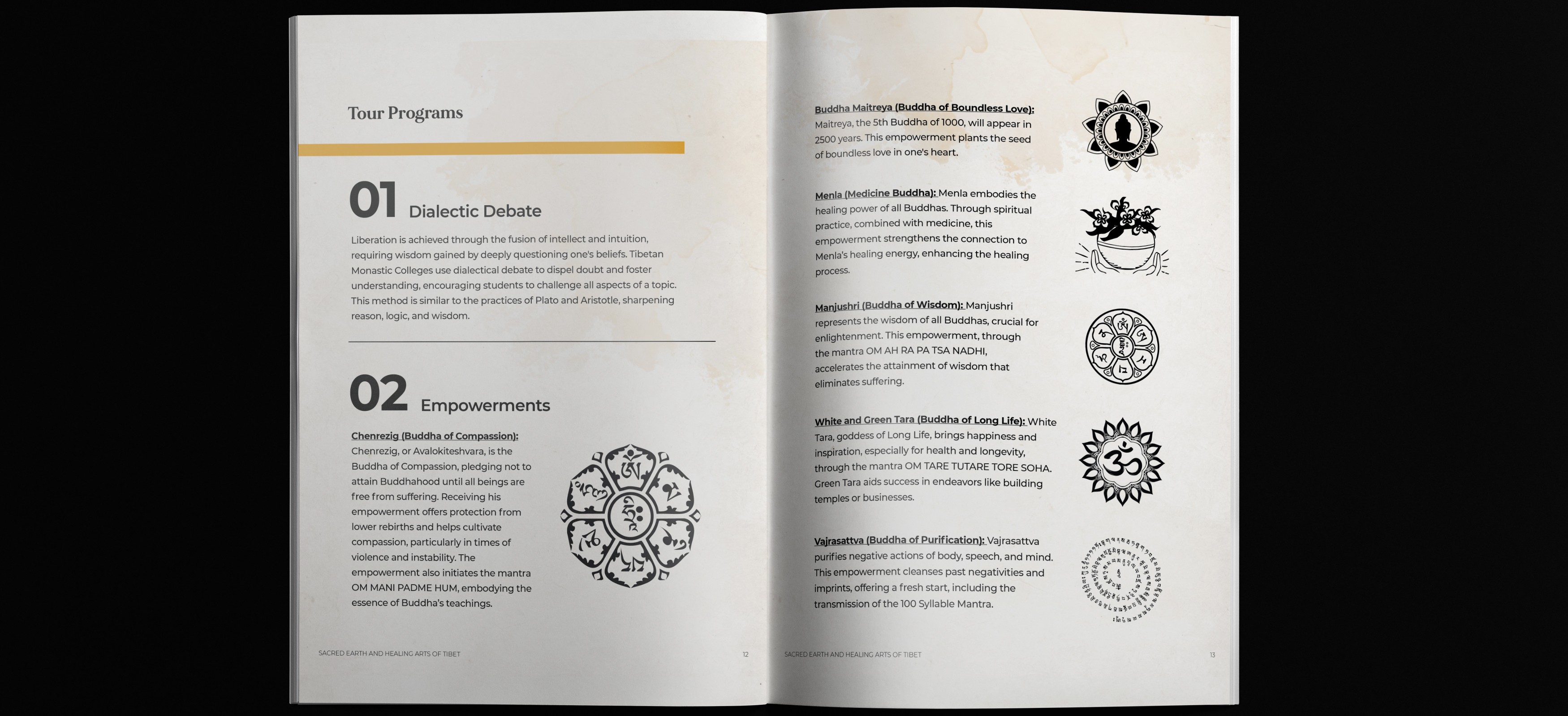
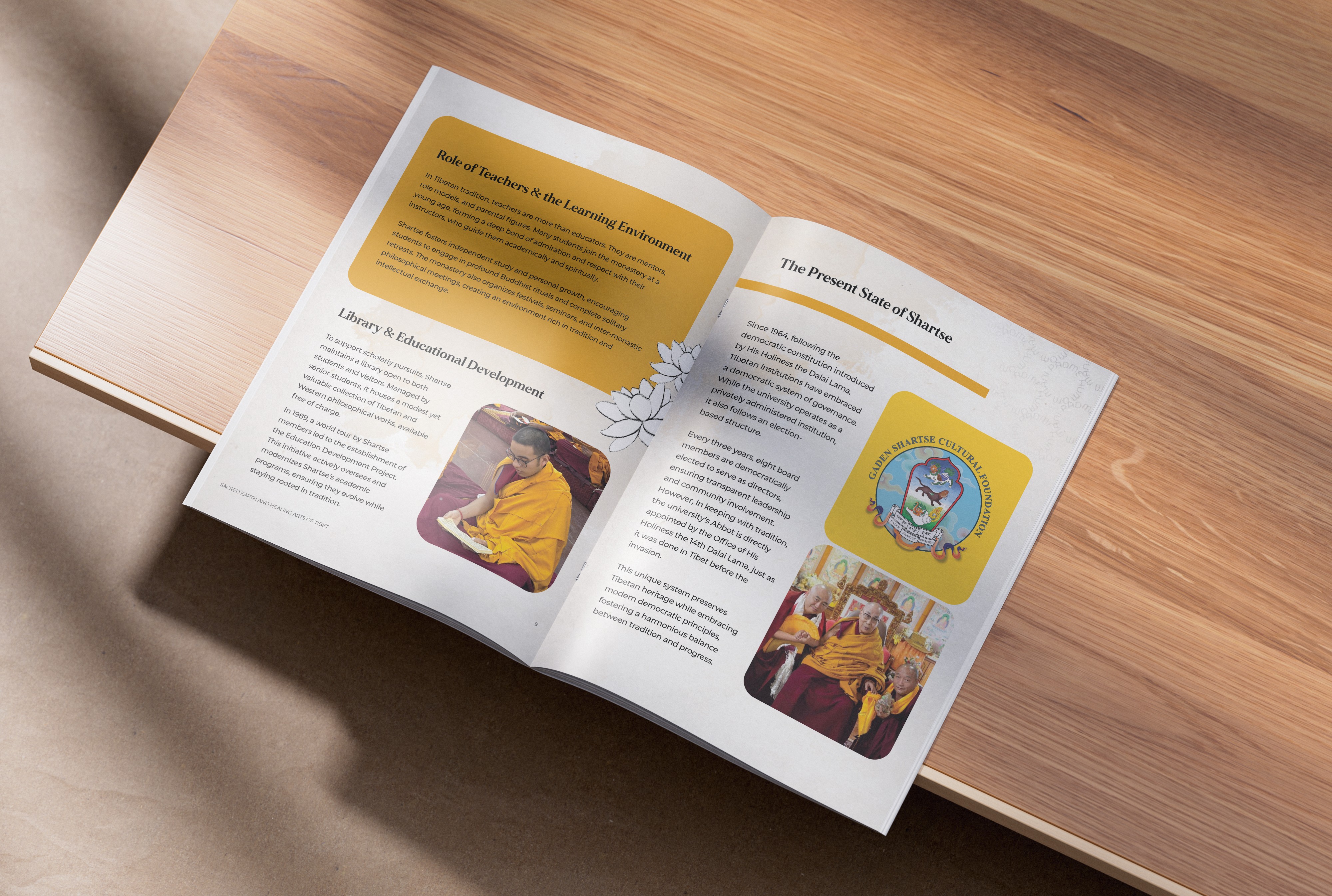
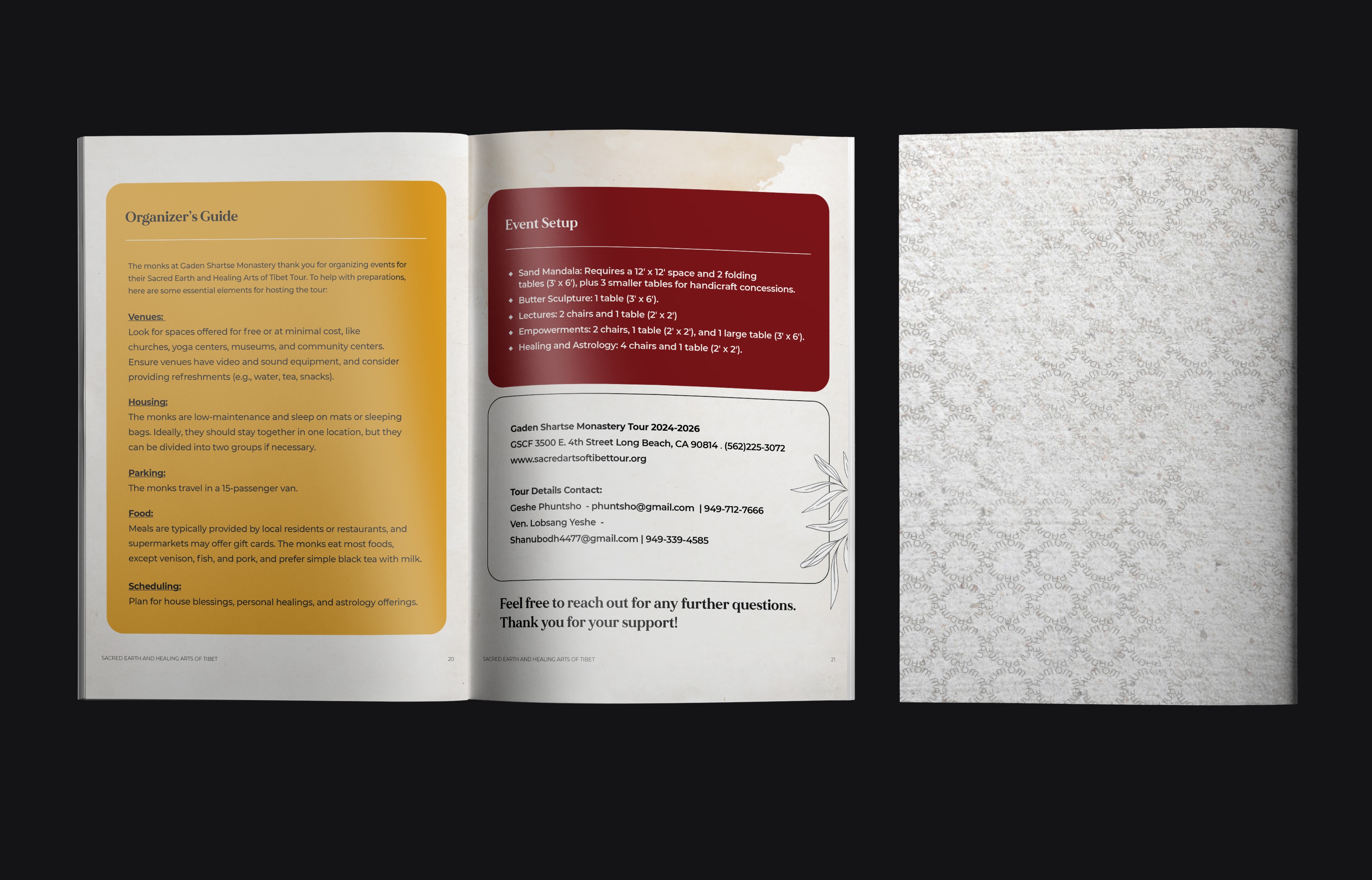
To transform the monastery’s originally dense, text-only content into a professional editorial experience, I implemented a strict typographic hierarchy. By replacing blocks of text with descriptive headers, subheaders, and bulleted lists, I ensured media members can skim for key context. I also integrated icons and mandala inspired motifs as a visual break system to guide the reader through the document. These elements were designed as modular assets, allowing the monastery to repurpose the icons and graphics for social media, event banners, and tour posters.
To transform the monastery’s originally dense, text-only content into a professional editorial experience, I implemented a strict typographic hierarchy. By replacing blocks of text with descriptive headers, subheaders, and bulleted lists, I ensured media members can skim for key context. I also integrated icons and mandala inspired motifs as a visual break system to guide the reader through the document. These elements were designed as modular assets, allowing the monastery to repurpose the icons and graphics for social media, event banners, and tour posters.
To transform the monastery’s originally dense, text-only content into a professional editorial experience, I implemented a strict typographic hierarchy. By replacing blocks of text with descriptive headers, subheaders, and bulleted lists, I ensured media members can skim for key context. I also integrated icons and mandala inspired motifs as a visual break system to guide the reader through the document. These elements were designed as modular assets, allowing the monastery to repurpose the icons and graphics for social media, event banners, and tour posters.
Thank you!
Thank you!
Thank you!
Want to work together?
GET IN TOUCH
Want to work together?