Galveston County Museum
Galveston County Museum
Galveston County
Museum
Visual Identity and Heritage Branding
Visual Identity and
Heritage Branding
Galveston County Museum is a local history institution dedicated to preserving and sharing regional heritage. I led visual and digital design efforts for the museum’s 50th anniversary rebranding, creating print and social media assets to refresh the brand presence and increase community engagement.
Galveston County Museum is a local history institution dedicated to preserving and sharing regional heritage. I led visual and digital design efforts for the museum’s 50th anniversary rebranding, creating print and social media assets to refresh the brand presence and increase community engagement.
Role
Role
Lead designer
Lead designer
Client
Client
Galveston County Museum
Galveston County Museum
Year
Year
2025
2025
Understanding the Problem :
Our research revealed several critical barriers to entry: most notably, the museum’s physical location inside a county courthouse severely hindered visibility and foot traffic. Additionally, the museum lacked a cohesive visual identity, and its digital presence struggled to compete with local attractions that utilized more sophisticated marketing and social media strategies. To the public, the museum felt like a "hidden" archive rather than a vibrant community landmark, making it difficult to attract younger demographics or maintain a consistent brand voice.
The Solution :
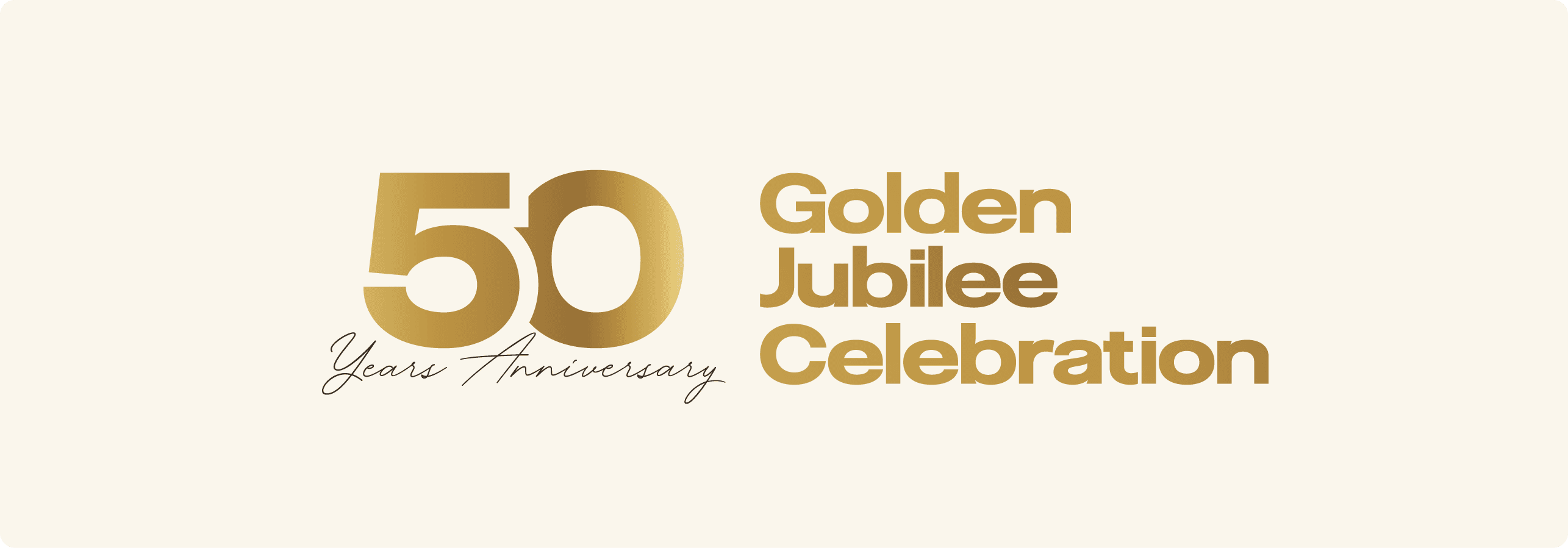
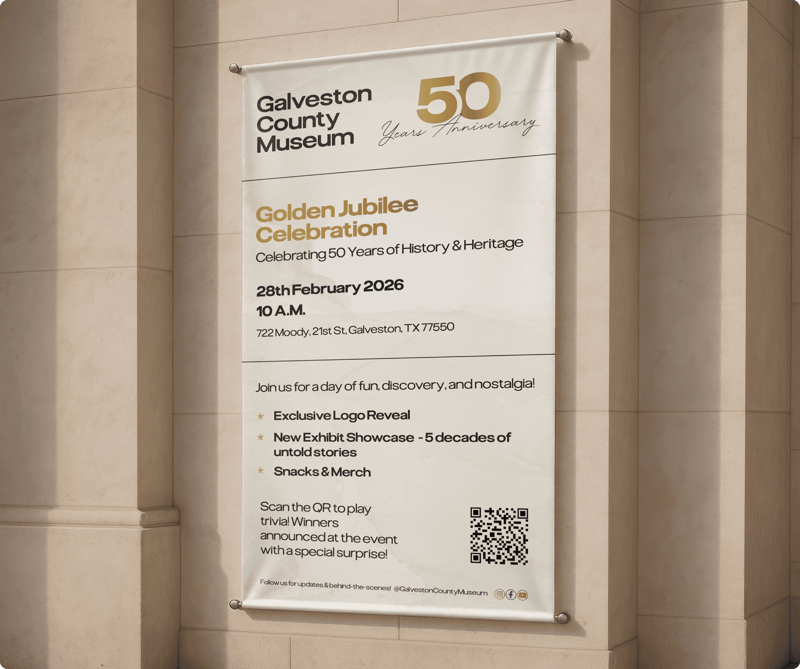
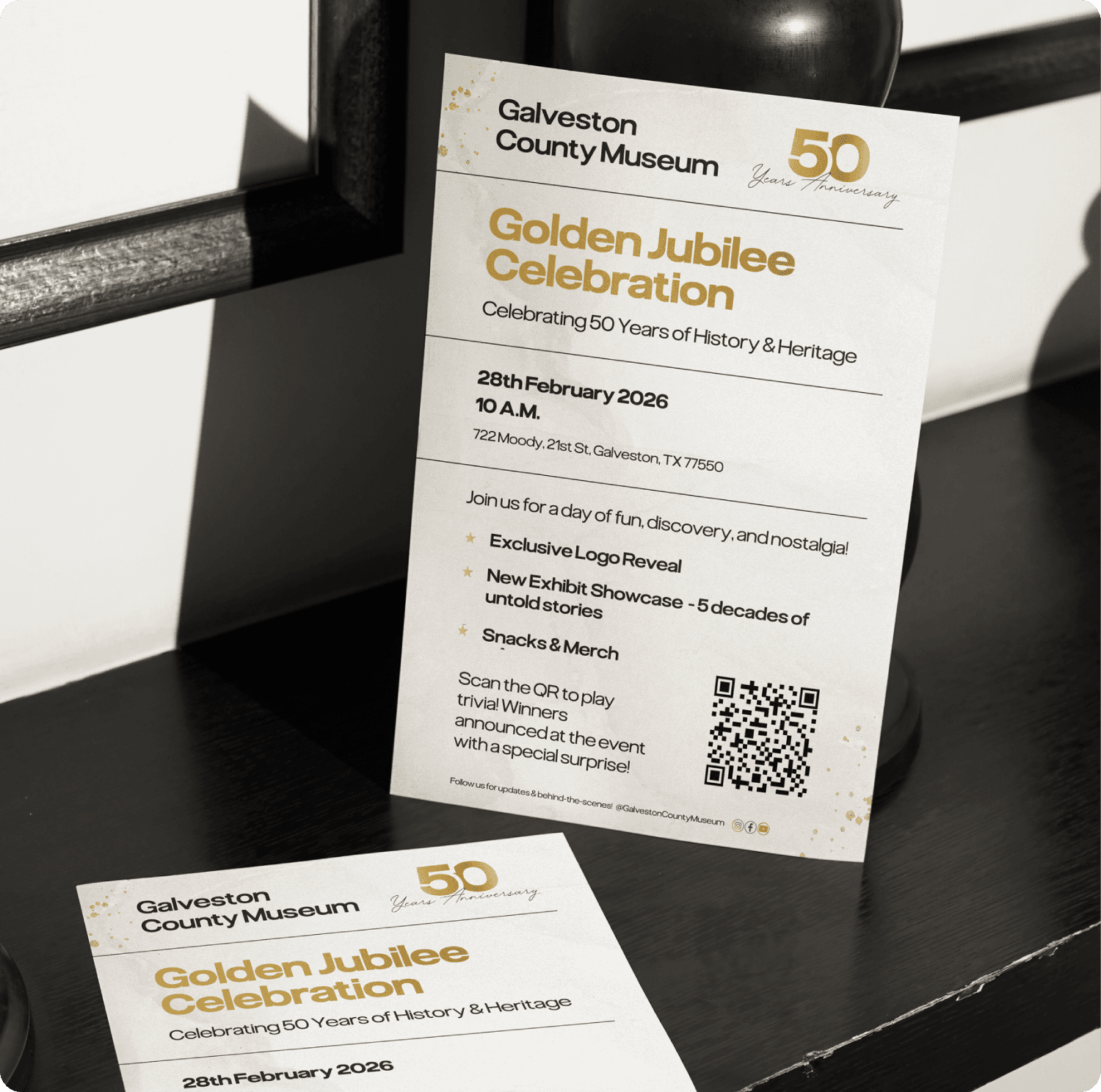
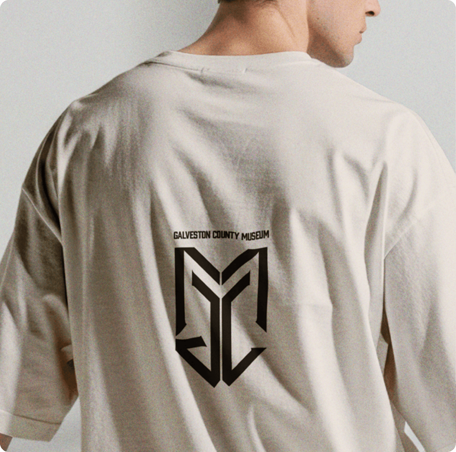
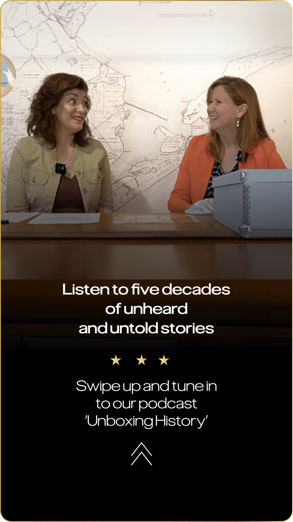
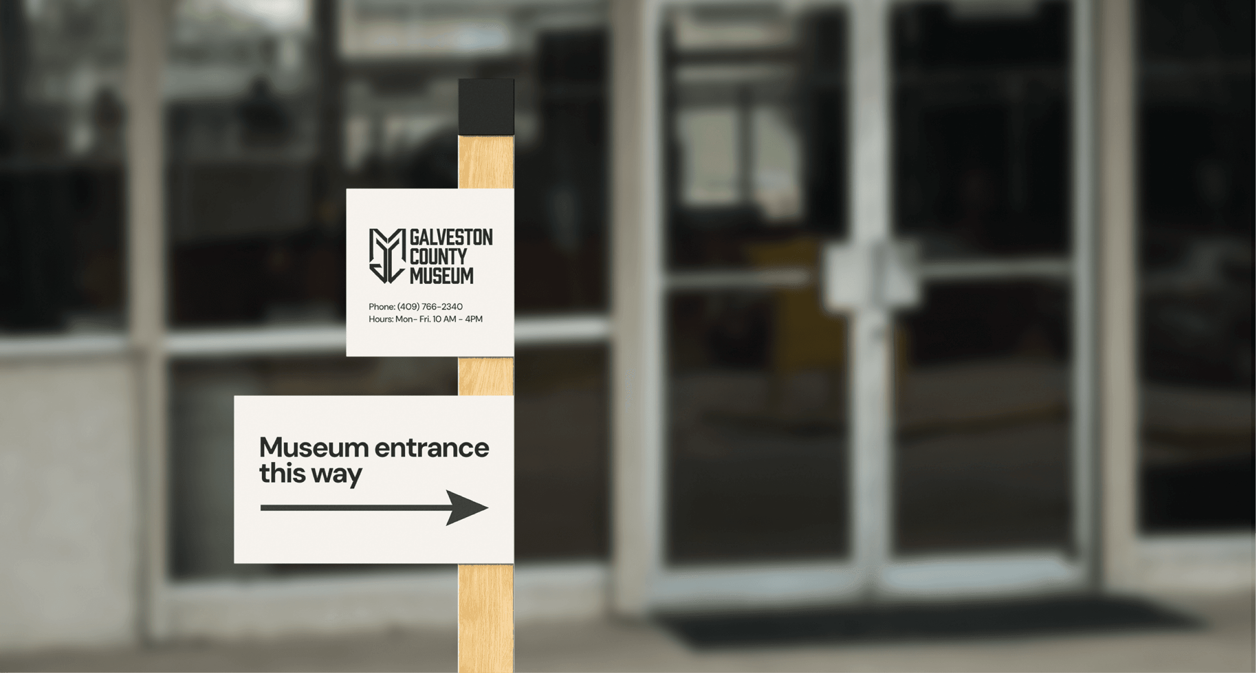
As the creative lead, I tackled the visibility issue by designing high-impact yard signs and prioritizing the physical address across all digital touchpoints, including website updates and social media stories. To solve the branding gap, I developed a modern logo designed to be unveiled at the 50th-anniversary celebration, establishing a "Golden Jubilee" aesthetic that felt prestigious yet accessible. Our strategy countered competitor influence by launching a "pre-buzz" campaign featuring paid ads, influencer partnerships, and a themed podcast series. I also designed tangible community touchpoints, including flyers for local businesses, giveaway stickers, and T-shirt concepts to transform the museum from a hidden courthouse wing into a recognized cultural destination.
Understanding the problem :
Our research revealed several critical barriers to entry: most notably, the museum’s physical location inside a county courthouse severely hindered visibility and foot traffic. Additionally, the museum lacked a cohesive visual identity, and its digital presence struggled to compete with local attractions that utilized more sophisticated marketing and social media strategies. To the public, the museum felt like a "hidden" archive rather than a vibrant community landmark, making it difficult to attract younger demographics or maintain a consistent brand voice.
The Solution :
As the creative lead, I tackled the visibility issue by designing high-impact yard signs and prioritizing the physical address across all digital touchpoints, including website updates and social media stories. To solve the branding gap, I developed a modern logo designed to be unveiled at the 50th-anniversary celebration, establishing a "Golden Jubilee" aesthetic that felt prestigious yet accessible. Our strategy countered competitor influence by launching a "pre-buzz" campaign featuring paid ads, influencer partnerships, and a themed podcast series. I also designed tangible community touchpoints, including flyers for local businesses, giveaway stickers, and T-shirt concepts to transform the museum from a hidden courthouse wing into a recognized cultural destination.
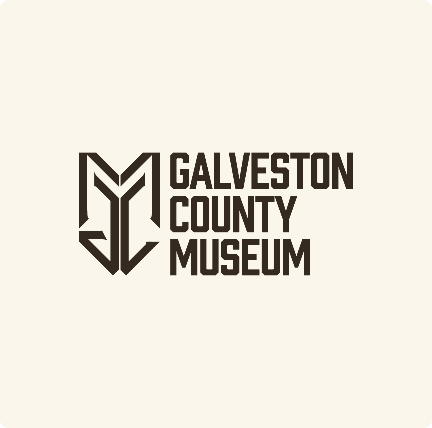
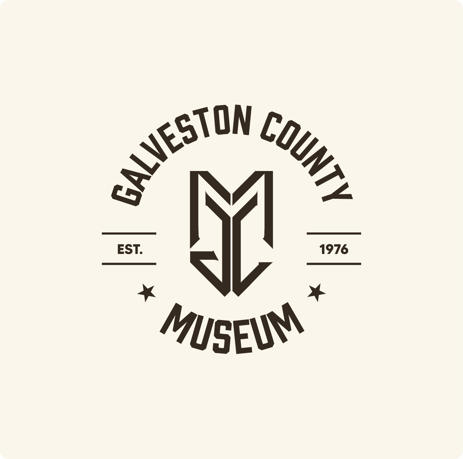
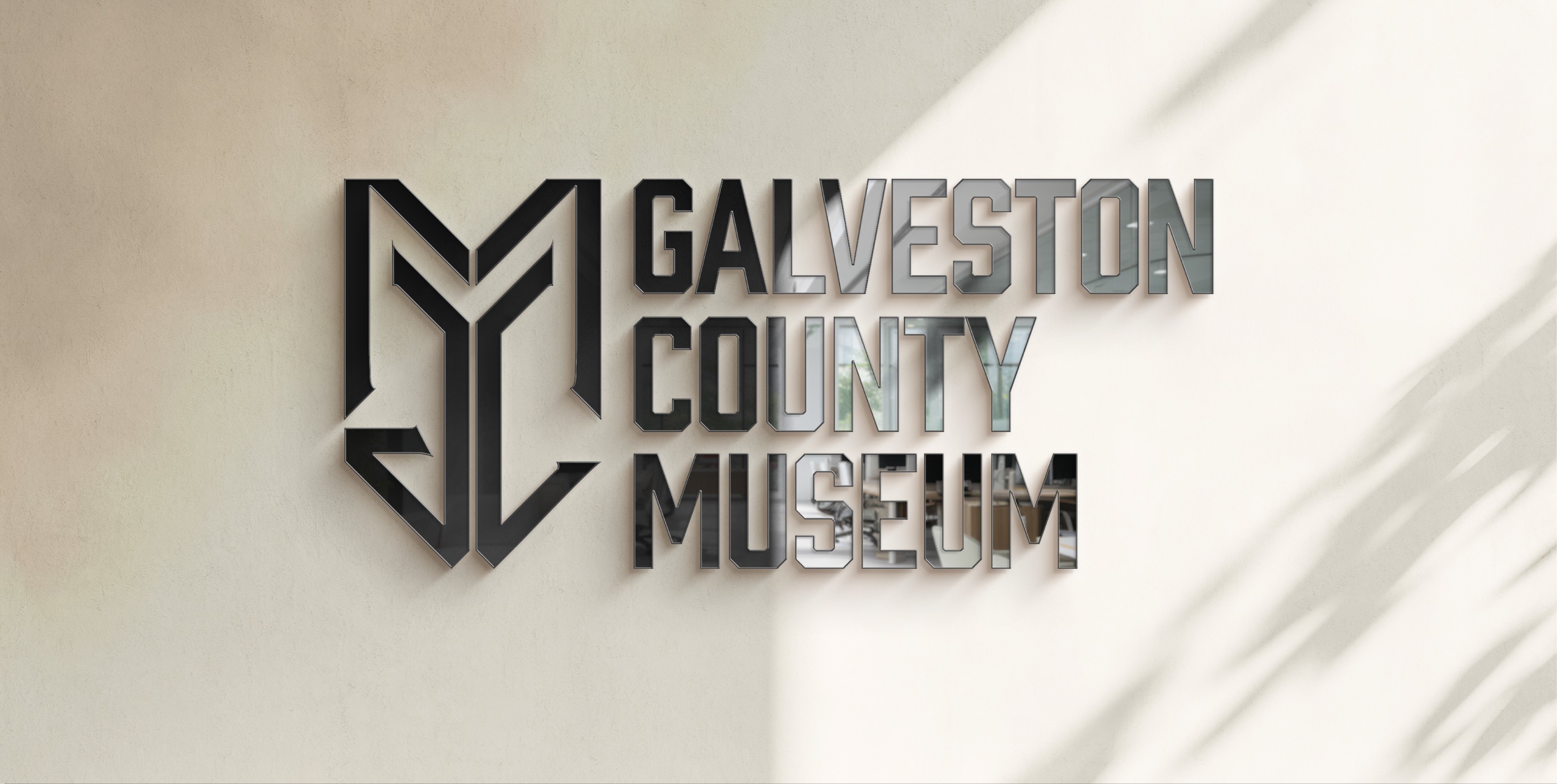
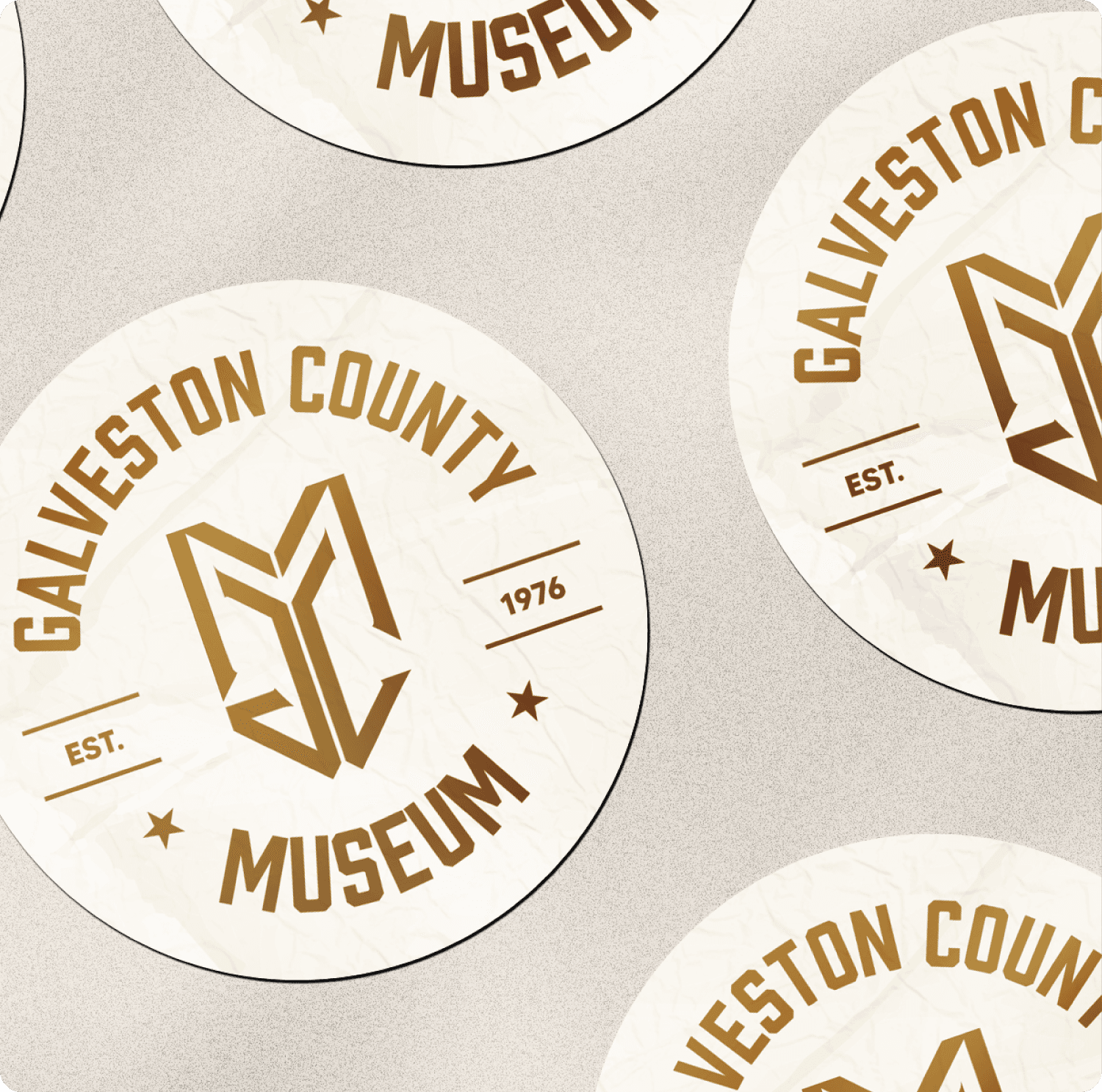
The new identity features a custom monogram that geometrically weaves together the initials GCM. Built on a mathematical grid, the design avoids "beachy" clichés, instead using a symbolic anchor at the base to honor Galveston’s port history. I paired the mark with a clean, geometric sans-serif font, adjusting the spacing between the letters to ensure the logo feels modern and remains easy to read. The final Golden Jubilee color palette was chosen specifically to elevate the museum's image for its 50th-anniversary celebration.
The new identity features a custom monogram that geometrically weaves together the initials GCM. Built on a mathematical grid, the design avoids "beachy" clichés, instead using a symbolic anchor at the base to honor Galveston’s port history. I paired the mark with a clean, geometric sans-serif font, adjusting the spacing between the letters to ensure the logo feels modern and remains easy to read. The final Golden Jubilee color palette was chosen specifically to elevate the museum's image for its 50th-anniversary celebration.
The new identity features a custom monogram that geometrically weaves together the initials GCM. Built on a mathematical grid, the design avoids "beachy" clichés, instead using a symbolic anchor at the base to honor Galveston’s port history. I paired the mark with a clean, geometric sans-serif font, adjusting the spacing between the letters to ensure the logo feels modern and remains easy to read. The final Golden Jubilee color palette was chosen specifically to elevate the museum's image for its 50th-anniversary celebration.
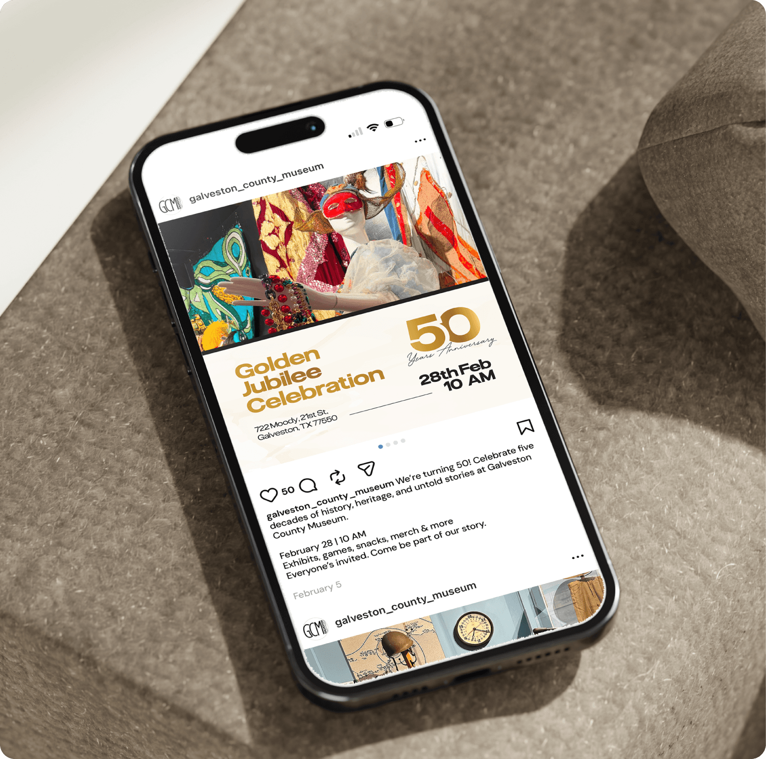
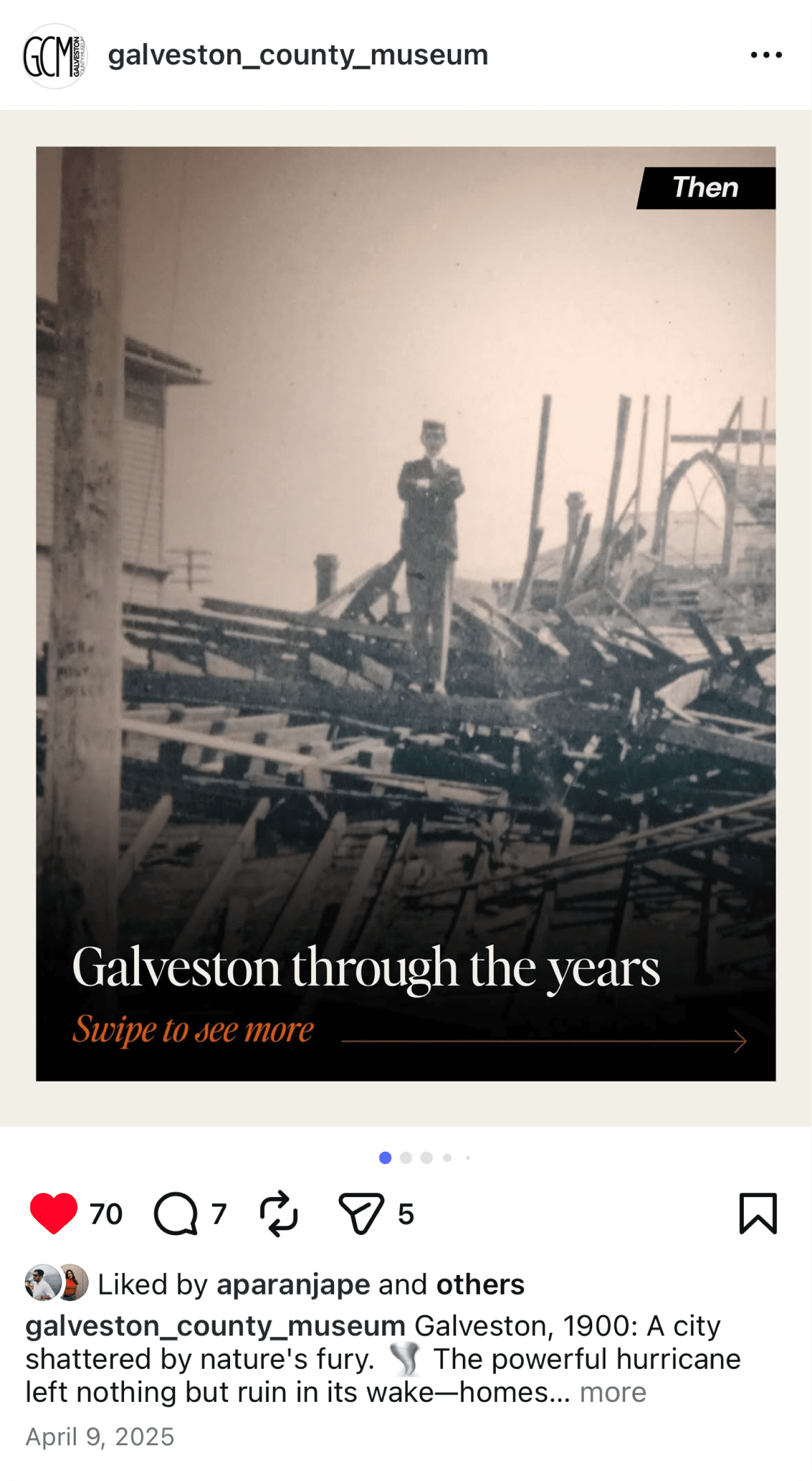
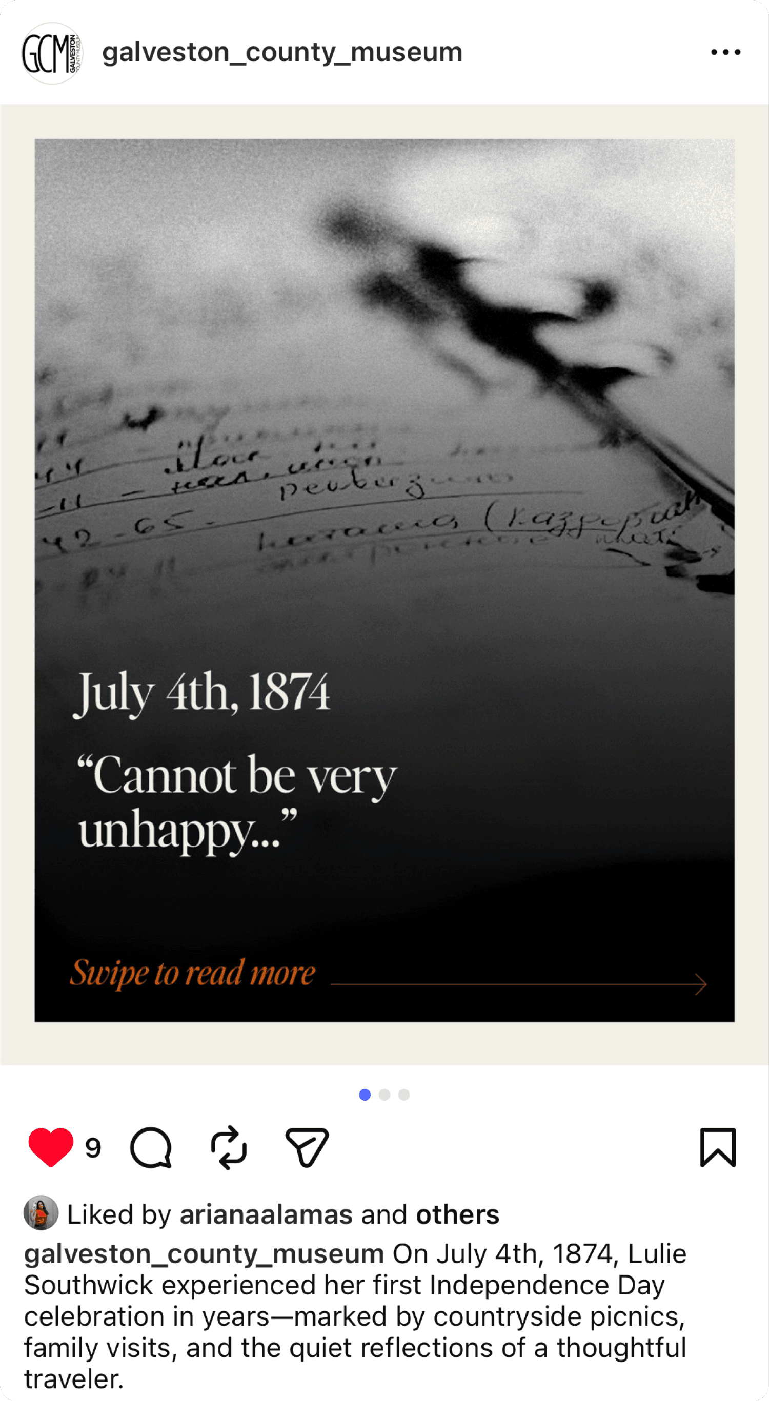
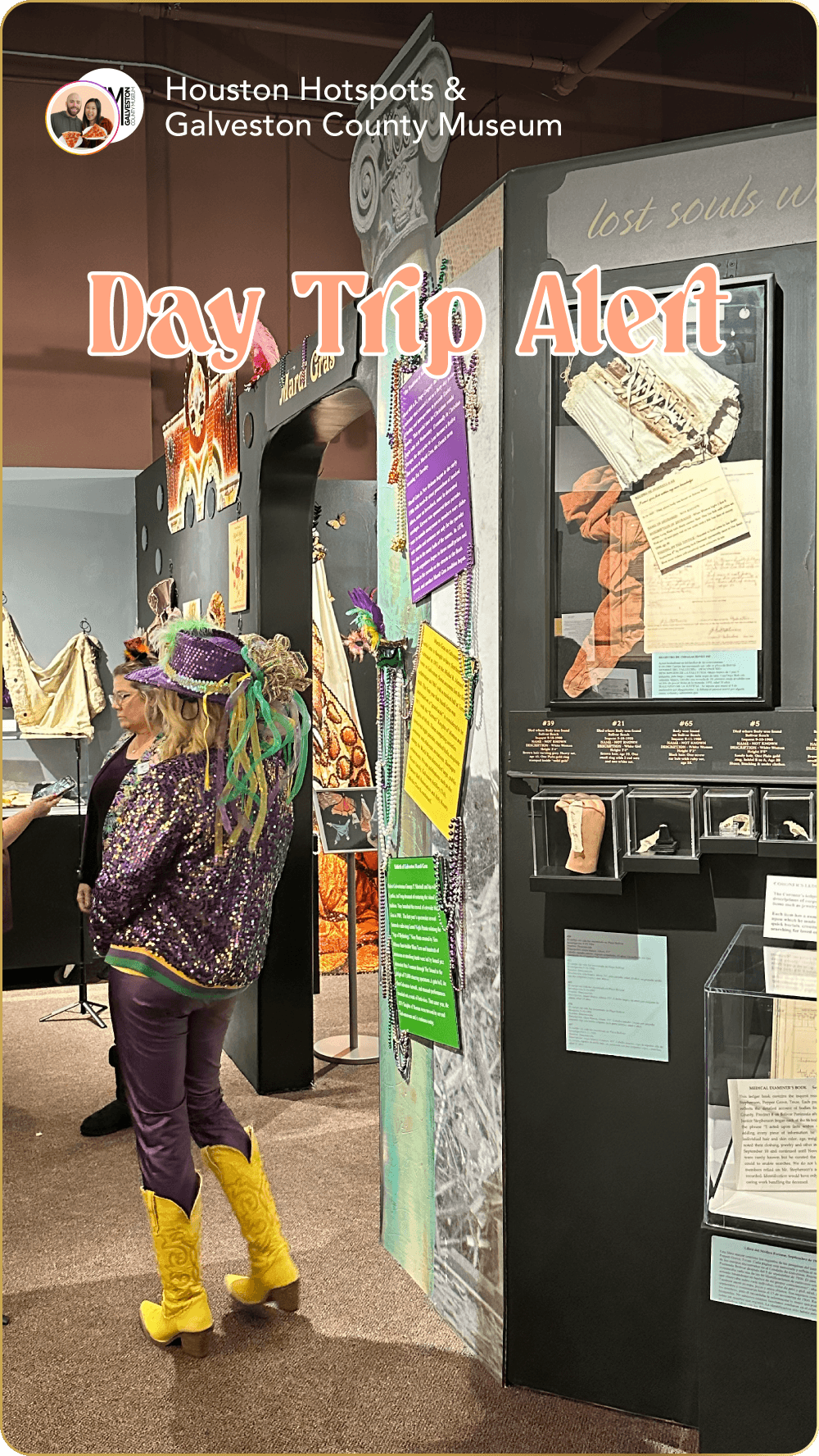
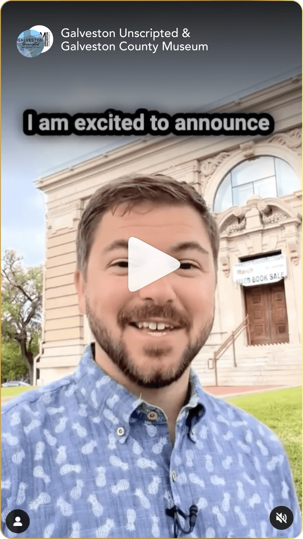
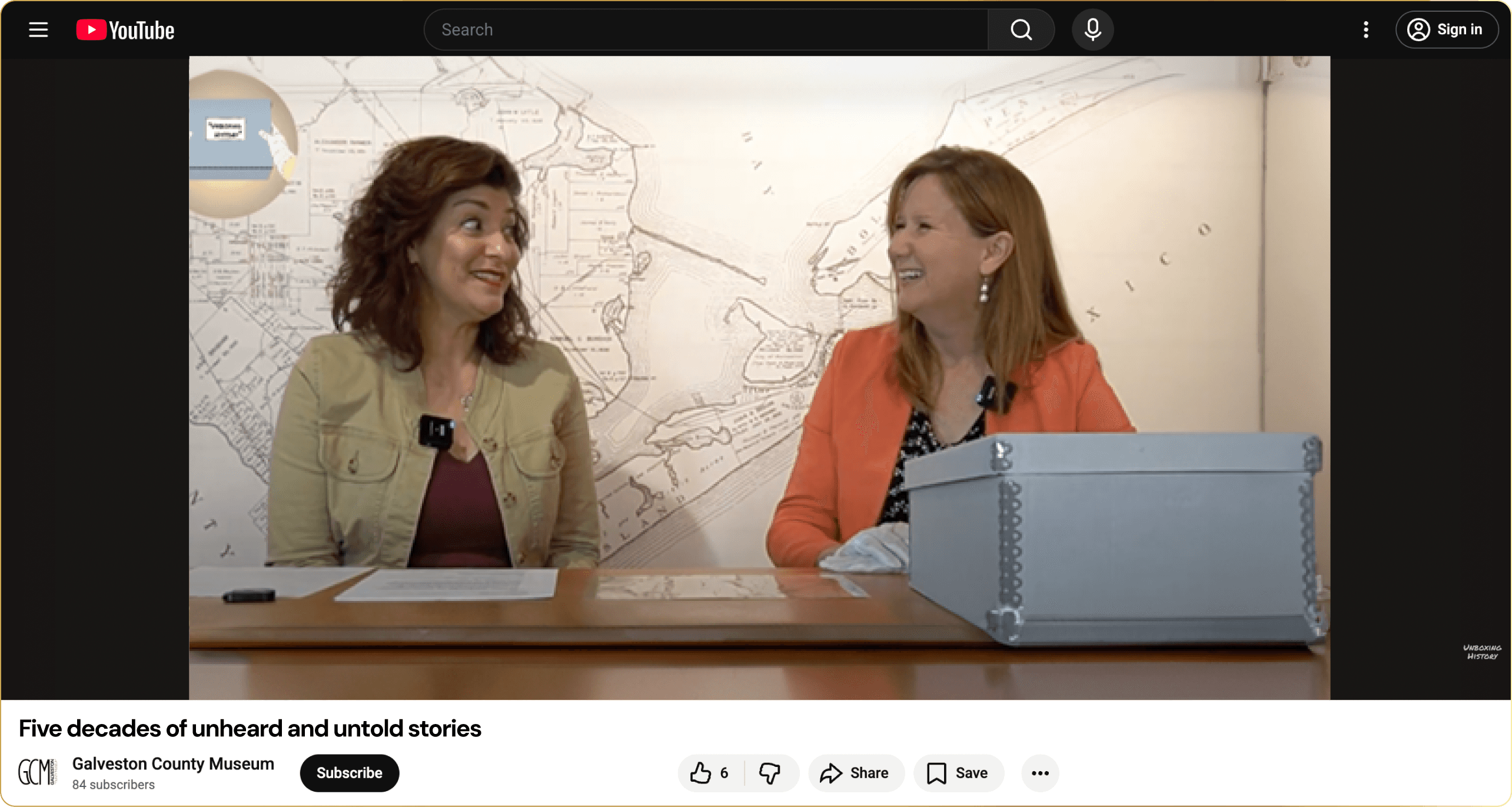
Led themed social campaigns for Galveston County Museum including “Galveston Before & After,” artifact diary highlights, influencer collaborations, and a 50th-anniversary podcast series, posting consistently 2–3 times per week to boost engagement and event visibility.
Led themed social campaigns for Galveston County Museum including “Galveston Before & After,” artifact diary highlights, influencer collaborations, and a 50th-anniversary podcast series, posting consistently 2–3 times per week to boost engagement and event visibility.
Led themed social campaigns for Galveston County Museum including “Galveston Before & After,” artifact diary highlights, influencer collaborations, and a 50th-anniversary podcast series, posting consistently 2–3 times per week to boost engagement and event visibility.
Thank you!
Thank you!
Thank you!
Want to work together?
GET IN TOUCH
Want to work together?