PrettySecrets
PrettySecrets
PrettySecrets
Integrated multi-channel design
Integrated multi-channel design
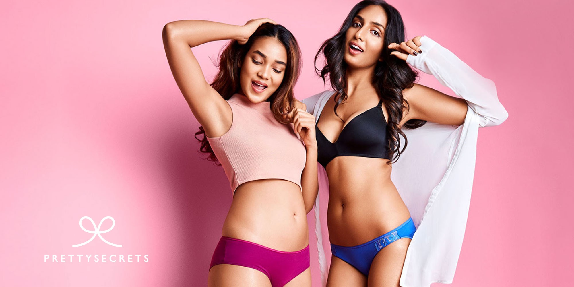
PrettySecrets is a design-led Indian lingerie brand known for its bold, modern approach to comfort and style. Inspired by the confidence of contemporary Indian women, the brand speaks to a young, expressive audience. I designed a range of brand collaterals including flyers, posters, social media content, catalogues, and magazine advertisements, and contributed to photoshoots to ensure visual consistency across touchpoints.
PrettySecrets is a design-led Indian lingerie brand known for its bold, modern approach to comfort and style. Inspired by the confidence of contemporary Indian women, the brand speaks to a young, expressive audience. I designed a range of brand collaterals including flyers, posters, social media content, catalogues, and magazine advertisements, and contributed to photoshoots to ensure visual consistency across touchpoints.
Role
Role
Senior graphic designer
Senior graphic designer
Client
Client
PrettySecrets
PrettySecrets
Year
Year
2017-2018
2017-2018
Understanding the Problem :
In a crowded lingerie market, the challenge was to carve out a distinct identity that resonated with a modern, spirited audience. We needed to move away from the traditional, functional perception of lingerie and position PrettySecrets as a fashion-forward choice for women aged 16 - 40. The goal was to transform the visual language into something energetic, youthful, and undeniably fun.
The Solution :
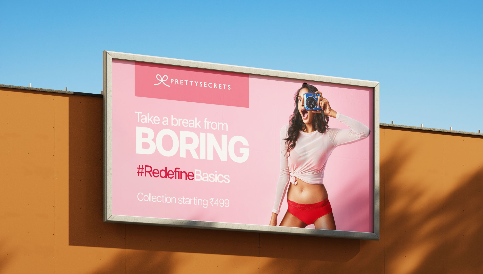
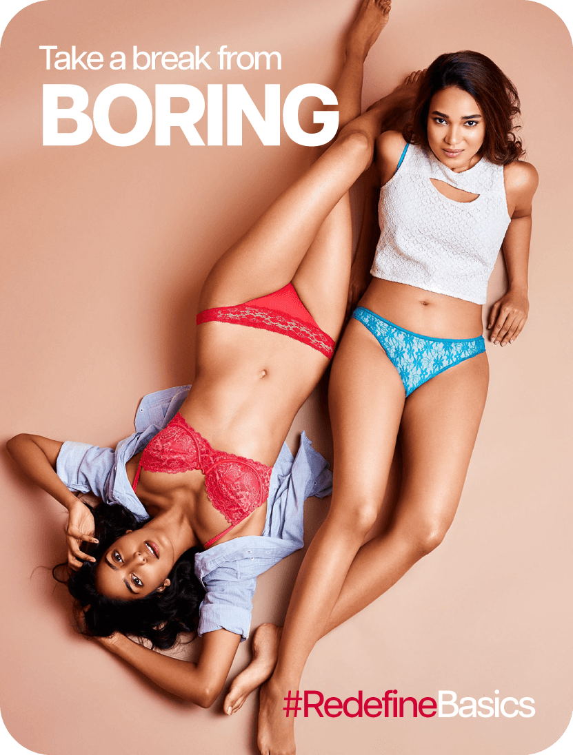
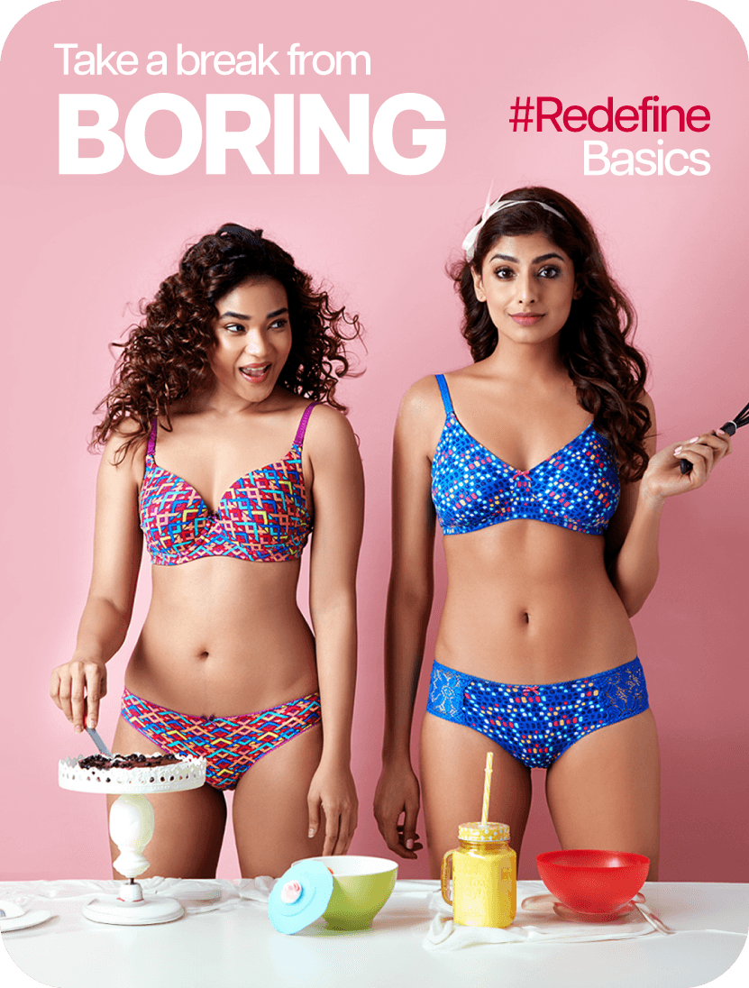
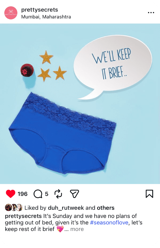
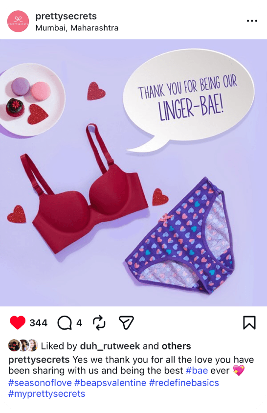
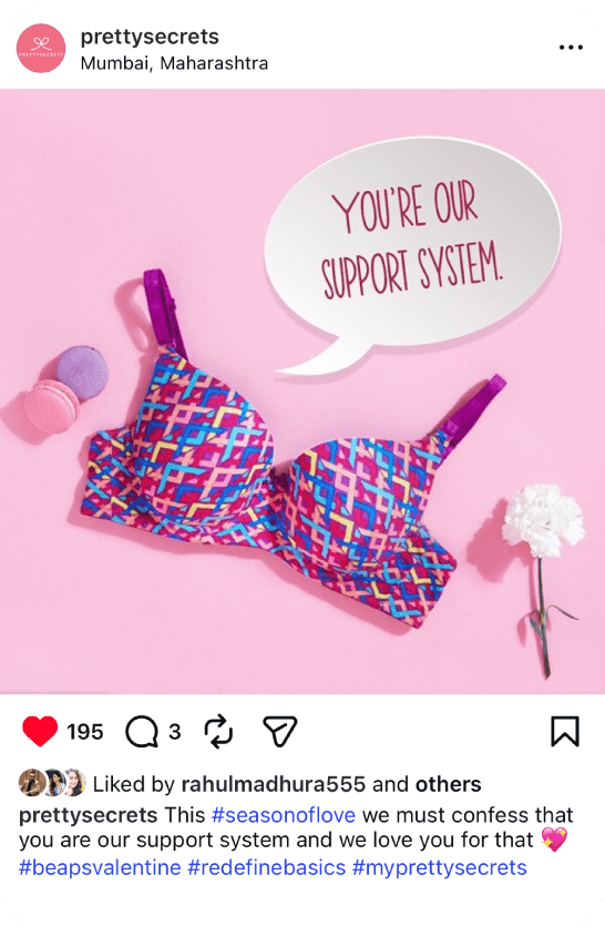
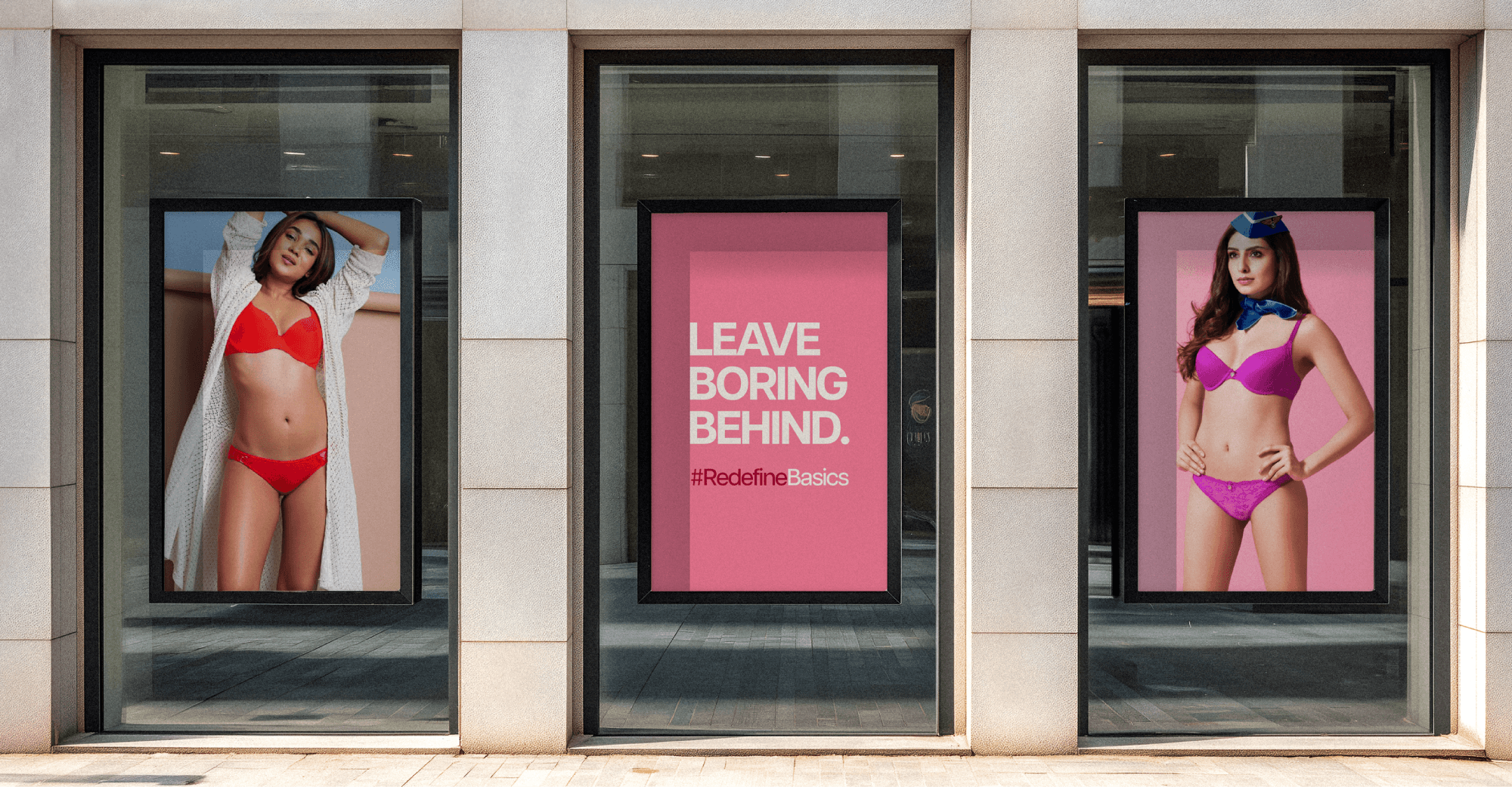
We developed the 'Redefine Basics' campaign as a direct response to industry norms. The core message ‘Take a break from boring’ encouraged customers to ditch standard nudes and blacks in favor of bold prints, vibrant colors, and quirky designs. I played a key role in bringing this vision to life across all touchpoints:
Art Direction: Collaborated on photoshoot concepts, selecting backdrops and poses that highlighted product personality.
Design Execution: Translated the high-energy ‘Redefine Basics’ aesthetic into billboards, store displays, newspaper ads, and digital assets for the web and app.
Brand Consistency: Ensured every flyer, standee, and social post reinforced the central campaign theme to build strong brand recall.
Understanding the problem :
In a crowded lingerie market, the challenge was to carve out a distinct identity that resonated with a modern, spirited audience. We needed to move away from the traditional, functional perception of lingerie and position PrettySecrets as a fashion-forward choice for women aged 16 - 40. The goal was to transform the visual language into something energetic, youthful, and undeniably fun.
The Solution :
We developed the 'Redefine Basics' campaign as a direct response to industry norms. The core message ‘Take a break from boring’ encouraged customers to ditch standard nudes and blacks in favor of bold prints, vibrant colors, and quirky designs. I played a key role in bringing this vision to life across all touchpoints:
Art Direction: Collaborated on photoshoot concepts, selecting backdrops and poses that highlighted product personality.
Design Execution: Translated the high-energy ‘Redefine Basics’ aesthetic into billboards, store displays, newspaper ads, and digital assets for the web and app.
Brand Consistency: Ensured every flyer, standee, and social post reinforced the central campaign theme to build strong brand recall.
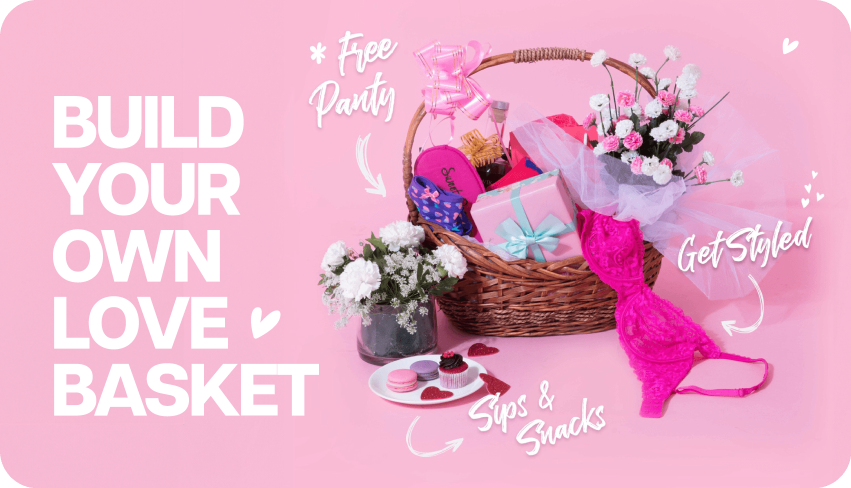
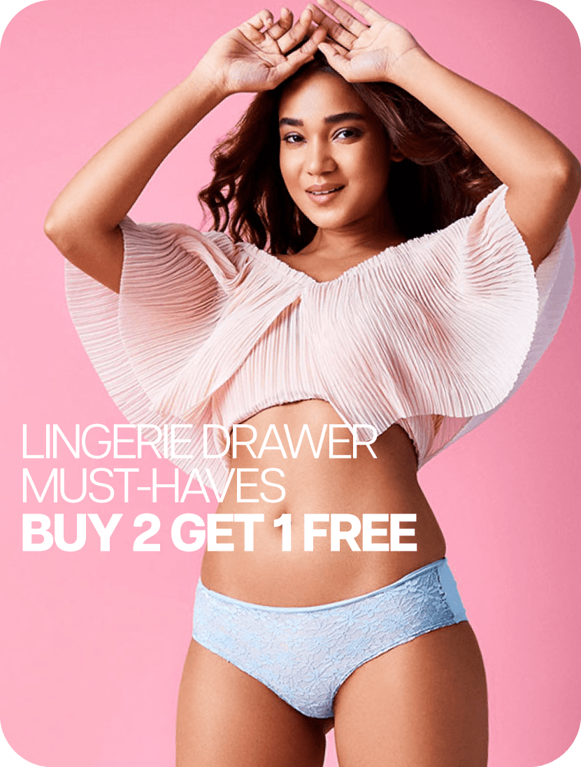
For Valentine's Day, we launched an interactive ‘Build Your Own Love Basket’ campaign. I assisted in the custom photoshoot styling and designed a promotional bundle system that allowed customers to curate their favorite pieces for a 20% discount. To drive engagement on social media, I paired these visuals with witty, relatable copy blending product utility with playful social storytelling.
For Valentine's Day, we launched an interactive ‘Build Your Own Love Basket’ campaign. I assisted in the custom photoshoot styling and designed a promotional bundle system that allowed customers to curate their favorite pieces for a 20% discount. To drive engagement on social media, I paired these visuals with witty, relatable copy blending product utility with playful social storytelling.
For Valentine's Day, we launched an interactive ‘Build Your Own Love Basket’ campaign. I assisted in the custom photoshoot styling and designed a promotional bundle system that allowed customers to curate their favorite pieces for a 20% discount. To drive engagement on social media, I paired these visuals with witty, relatable copy blending product utility with playful social storytelling.
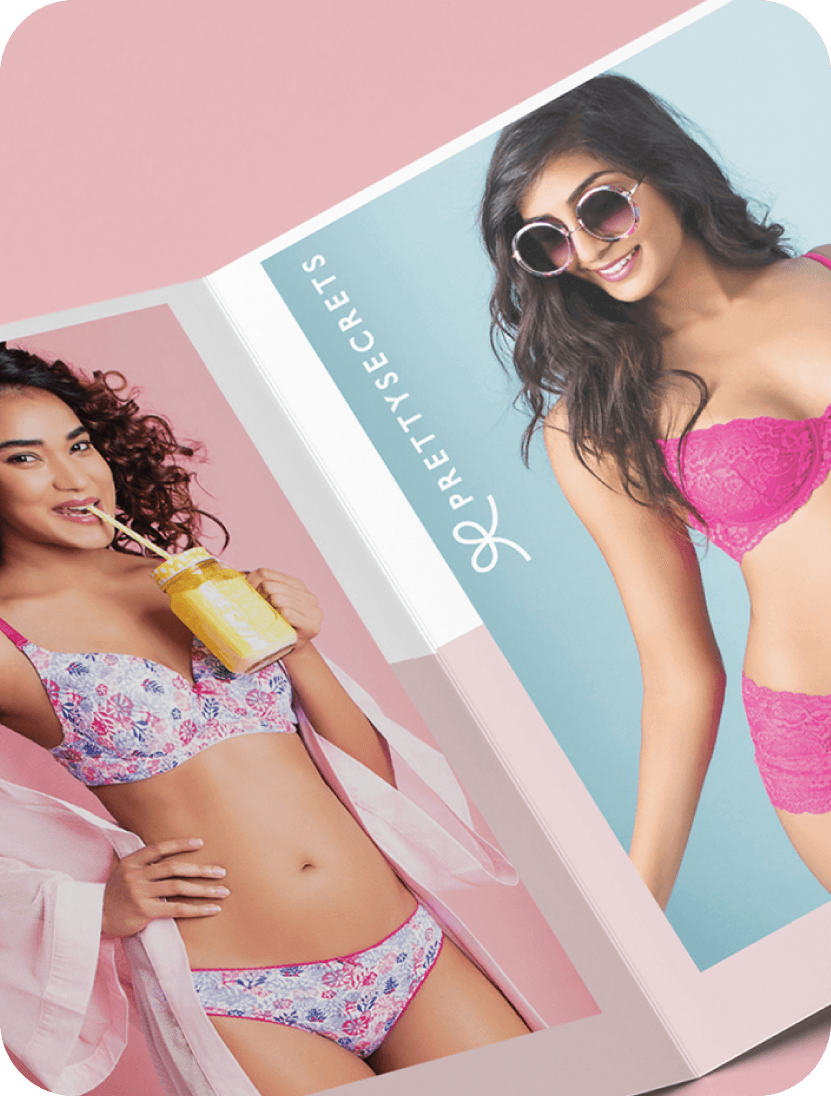
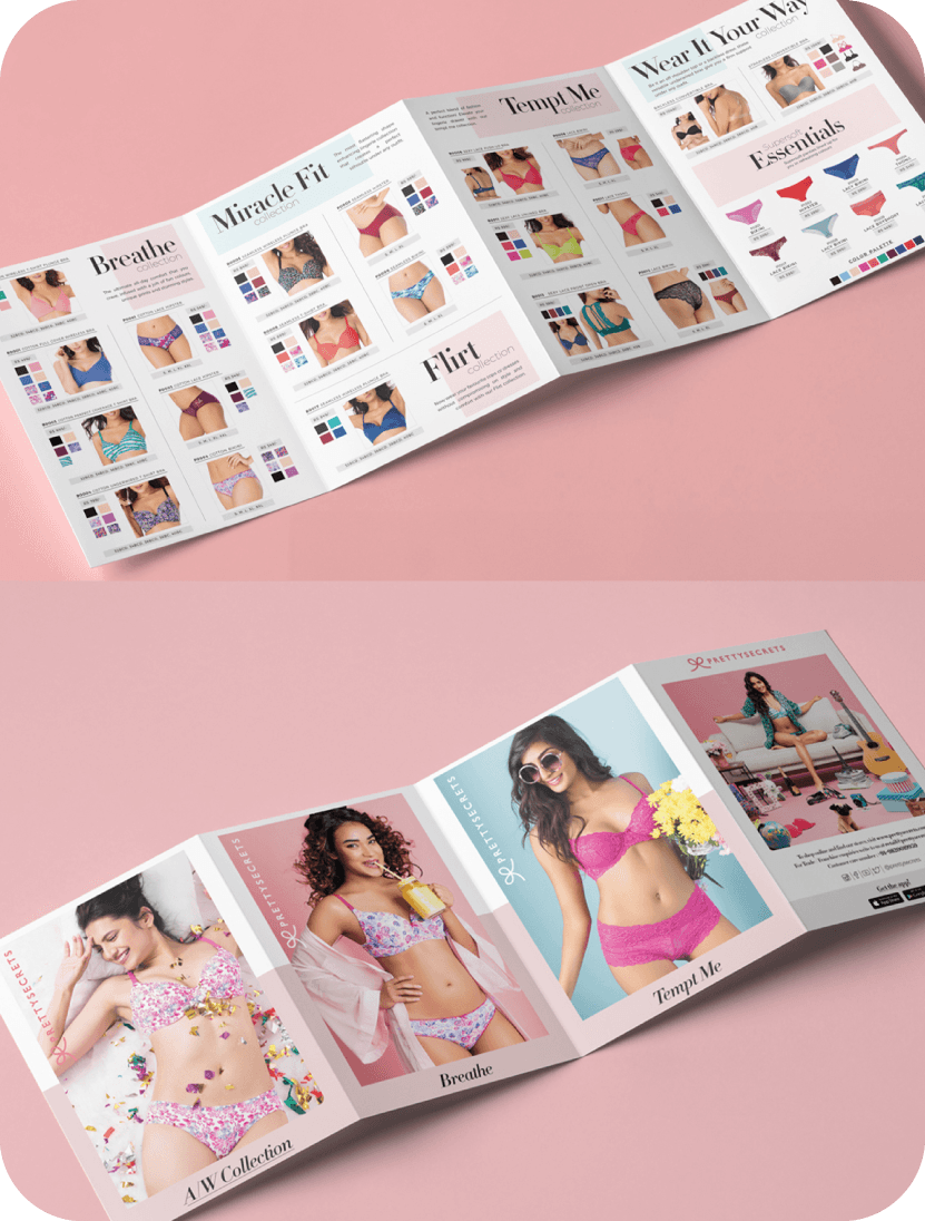
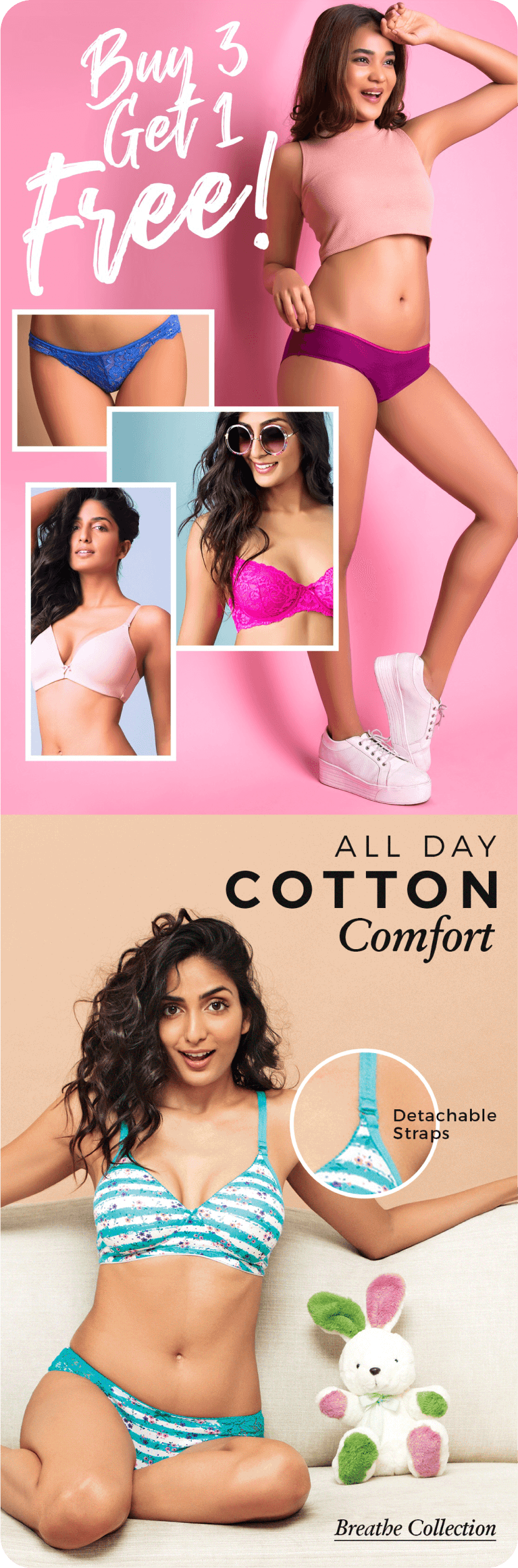
I designed a comprehensive four fold catalog for in-store use, serving as a physical material for customers to explore our latest collections. The layout focused on clean information design, elegantly presenting product details, fabric specifications, and pricing while maintaining the brand's signature vibrant aesthetic.
I designed a comprehensive four fold catalog for in-store use, serving as a physical material for customers to explore our latest collections. The layout focused on clean information design, elegantly presenting product details, fabric specifications, and pricing while maintaining the brand's signature vibrant aesthetic.
I designed a comprehensive four fold catalog for in-store use, serving as a physical material for customers to explore our latest collections. The layout focused on clean information design, elegantly presenting product details, fabric specifications, and pricing while maintaining the brand's signature vibrant aesthetic.


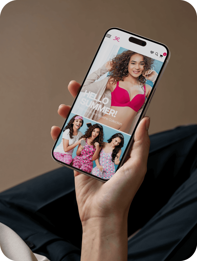
Designed weekly newsletters that communicated seasonal sales, product highlights, and community initiatives.
Designed weekly newsletters that communicated seasonal sales, product highlights, and community initiatives.
Designed weekly newsletters that communicated seasonal sales, product highlights, and community initiatives.

Thank you.
All imagery used in this case study is property of PrettySecrets. These visuals are included for presentation purposes only to demonstrate my design work and creative process. No copyright infringement is intended.
Thank you.
All imagery used in this case study is property of PrettySecrets. These visuals are included for presentation purposes only to demonstrate my design work and creative process. No copyright infringement is intended.
Want to work together?
GET IN TOUCH
Want to work together?